DOES I HAVE PERMISSION? Or do you got it?I really want those. Also Data disc should be for moderators or something. If mods are a separate rank.
I am kind of busy all of a sudden now. Normally, I would have it done myself, but, yeah, go to town.
None.


Acceptance ?
edit: hold on, fixing purple.
edit2: not fixing purple. Devourer crushed mah dreams.
None.
Still, they are pointless and minerals got a completly different meaning, sorry ;(
Please report errors in the Staredit.Network forum.

Relatively ancient and inactive


Give me skin change under extras under shoutbox or give me death.
None.
I made some rank icons based on torus knot.
I'm not sure if anyone will like it


Preview:

None.
What do you mean by "no, thanks"? I am not offering anything, just making an attempt... or, say, trying to help. >_>
Edit: And while you're at it, make a version that is about twice the size of the online/offline icon with the rank symbol on the left and the name of the rank on the right.
Something like this?

None.
I mean, I prefer the current military style rankings.
I mean, I prefer the current military style rankings.
There are actually 3 active styles. You can switch between them in the settings.
None.
wat. I think Adeons set is Boss. I'd use it.
Actually if they were a choice I would switch to them asap.
None.
Then I think it's best to make the bigger version enhanced (with shadows, shading and stuff) and the smaller ones more cartoonish.
By the way, don't you think it's better to make them just the bigger icon, without the text in the image? The rank name could be html text, this way when making a new theme the person is free to change its color/font/formatation.
Tomorrow I'll update my last set. Not that I'm begging to add these, but who knows
Post has been edited 1 time(s), last time on Jul 25 2010, 4:14 am by adeon.
None.
I was disappointed in the edits of the banner images. It looks like someone just took a fuzzy circle eraser and erased some stuff, but didn't bother to finish erasing. There are other areas where a normal eraser was used at a less than 100% opacity, which creates layer. The right way to do it is through a gradient on the alpha channel.


Please consider using the images attached.
The total of the 9 images is 622 kB
If you use the topleft and topright images instead of the 6 images, the total is 415 kB. That's 30% less.
The current usage of 8 images is 650 kB
There is no need for the rank images other than what we already have next to our names. Even the "Rank:" is superfluous and could be dropped out.
Attachments:
"Parliamentary inquiry, Mr. Chairman - do we have to call the Gentleman a gentleman if he's not one?"
Relatively ancient and inactive
I'd go further than Rockz; Presenting the same information twice is messy. Remove the rank indicator under Offline/contact altogether. If you're not going to put in moderator icons, than you can work around that and make a new "This user moderates this forum" indicator somewhere in the post. Possibly taking the place of the current second Rank indicator.
None.
Then what about not displaying the icon next to the nickname on postings, but only below online/contact buttons on higher res instead?
None.

We can't explain the universe, just describe it; and we don't know whether our theories are true, we just know they're not wrong. >Harald Lesch
I'd go further than Rockz; Presenting the same information twice is messy. Remove the rank indicator under Offline/contact altogether. If you're not going to put in moderator icons, than you can work around that and make a new "This user moderates this forum" indicator somewhere in the post. Possibly taking the place of the current second Rank indicator.
That just gave me another idea:
We already have really good 3-rank icon sets. Adding a GMod would probably seem out of place for most of them. So why not replace the "Rank: Veteran" indicator under offline/contact with DTBKs images for staff positions?
Because I really like the look of those and that way we could have the best of 2 worlds.
There is no need for the rank images other than what we already have next to our names. Even the "Rank:" is superfluous and could be dropped out.
It shouldn't due to the fact that you can hide these icons.
Please report errors in the Staredit.Network forum.
We can't explain the universe, just describe it; and we don't know whether our theories are true, we just know they're not wrong. >Harald Lesch
It shouldn't due to the fact that you can hide these icons.
When someone doesn't want to see ranks why force them on him?


 MadZombie


 DT_Battlekruser
 A_of-s_t
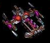

 Oh_Man -- https://youtu.be/3mpjxspSUtQ I defeated the hell boss yall, bow to my power
 Roy
Roy
