I have finally created the new skin for my site, and the whole new coding setup, it is much more easily updated, and I now use tables to display triggers, rather than pictures, unlike my old site, this site was made from scratch by hand, and it uses CSS and javascript to make it extremely updateable, and even without PHP, it allows the use of skins, even custom skins.
I present:
Falk's ZoneSpecial thanks to Farty for making the notepad javascript, and to Test for helping me implement it into the site.
I just want to make sure everyone is okay with the new look, and get any complaints out of the way before I remake the rest of the site, so speak now, or forever hold your peace

Those of you who would like to see how it has changed, compare with the old version:
Old Version
Post has been edited 1 time(s), last time on Oct 11 2008, 5:02 am by Falkoner.
None.
The shiny and flailing borders are messing with my eyes.
None.
We already discussed this, I likez my warm colors, maybe I'll make a little skin for you darker people, perhaps a Maplantisish skin?
None.
The colours are nice and appealing, but the
borders are unappealing.
None.

ALL PRAISE YOUR SUPREME LORD CORBO


We already discussed this, I likez my warm colors, maybe I'll make a little skin for you darker people, perhaps a Maplantisish skin?
Just thought I should correct you but green is not a warm color.
Site's looking better, I'd take away the stupid green bars from the menu and the underlines in the menu links. That's it.
fuck you all
border-style: solid;
Gogo, fix.
I tried it, and I didn't like it, however, I will take that into consideration when making other skins.
Just thought I should correct you but green is not a warm color.
Light green is, and that's what he's complaining about
I'd take away the stupid green bars from the menu and the underlines in the menu links. That's it.
I'll give it a try, see if I like how it looks.
None.
Well, tested it out without the green bars, and I like it, so I'll stick with than, thanks Corbo, it looks much better in IE without those.
Also, what the hell is the notepad along the side for? Is there actually any intended use for it?
Taking notes?
I figure if someone's looking through like a reference list, they might want to jot down some things when they see them, and it's kinda handy.
None.

We can't explain the universe, just describe it; and we don't know whether our theories are true, we just know they're not wrong. >Harald Lesch
MUCH better. A few suggestions though:
I can't read the button at the very bottom that takes me back to the top. Don't use that fancy font for it or enlarge the text without increasing button size, if thats possible.
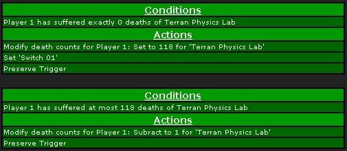
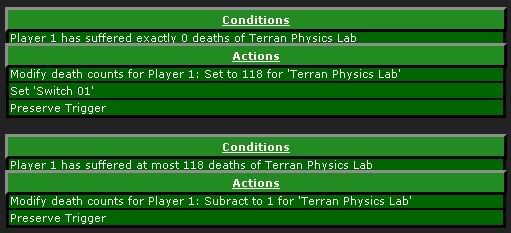
I'd right align the headers of the trigger boxes: "Conditions", "Actions"
Have a little more space between the lines of the triggers. Due to the black line after each command it looks a little cramped.
I am not disturbed by the solid green background, but of course a nice background picture (again, not too bright) might look cool. Or at least a color gradient from green to black.
Really? You don't think these borders make everything look clearer?
new:
^old
What chuiu has done was exactly what I was trying to portray to you.
None.
I can't read the button at the very bottom that takes me back to the top. Don't use that fancy font for it or enlarge the text without increasing button size, if thats possible.
Changed, is it too fat now? EDIT: Yes, it was, made another
Newest one:

New one:

Old one:

I'd right align the headers of the trigger boxes: "Conditions", "Actions"
Tried it, it's unbelievably ugly

Have a little more space between the lines of the triggers. Due to the black line after each command it looks a little cramped.
/agreed And I have now changed it, it looks much better.
Really? You don't think these borders make everything look clearer?
I just don't like how they look, I think the thicker padding makes it more clearer now, perhaps that helps?
If you still do not like it, as I said, the site allows custom skins, so when I get the Settings page up, and can just edit my CSS and link it to that.
Post has been edited 1 time(s), last time on Oct 11 2008, 6:30 pm by Falkoner.
None.
ALL PRAISE YOUR SUPREME LORD CORBO
The Buttons look good. Just don't use the yellow glow with the shadow cause, well, it doesn't look that good. Just move the glow so it hides a bit in the bottom or use a different shadow drop (keeping the one you have right now)
Light green is, and that's what he's complaining about
Why is people so stuborn nowadays.
LinkThey use it to teach little kids (I think), hope you like it.
fuck you all
Light green has yellow in it, yellow is a warm color.
Light green is more like yellow with a hint of blue, dark green is like blue with a hint of yellow, this is light green, so it has more yellow.
None.

Relatively ancient and inactive
I like it better. Too many borders. Set them to one or two pixels. Waay too annoying. And set the color of the border to black, not whitish. This is all for the trigger things.
Also, bad banner and a cut style is annoying. People who use only 50% of the screen are those who can't probably use CSS.
None.
Also, bad banner and a cut style is annoying. People who use only 50% of the screen are those who can't probably use CSS.
Which browser are you using? Also, the banner is not that huge, if you have the window so small, I'm not going to go out of my way to accommodate you.
None.
It's... Better? I agree with everyone else about the borders.