When making images, you should automatically make them 2560x1600 at the minimum, save a png backup, and post a 90/95/100 quality jpg of the image.
"Parliamentary inquiry, Mr. Chairman - do we have to call the Gentleman a gentleman if he's not one?"
I don't like that to be honest... too unrealistic, once again
Please report errors in the Staredit.Network forum.
Who cares? Good art isn't necessarily realistic.
None.
When making images, you should automatically make them 2560x1600 at the minimum, save a png backup, and post a 90/95/100 quality jpg of the image.
rockz gave very good advice. I usually prefer working in native resolution for smaller images (making a 80x30 image in native, for instance, is a lot better than making a 800 x 300 image then downsampling), but for large images such as wallpapers, I would rather work on them in a substantially larger canvas (4000x3000 for the 4:3 aspect ratio), and crop/downsize when needed.
Also, always add text after the downsizing, not before, and never rasterize text layers unless needed for special effects.
None.
PyMS and ProTRG developer


New planet:

I believe I'm going to put this one and my last one together in a scene.
This..is...hot, seriously.
Please report errors in the Staredit.Network forum.

>be faceless void >mfw I have no face
New planet:
I believe I'm going to put this one and my last one together in a scene.
The atmosphere is too big, and I'm not liking the general colour of it. I would add some other colour like green or blue over the top to tint it a bit.
Definite improvement however.
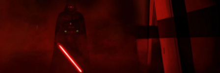
Red classic.
"In short, their absurdities are so extreme that it is painful even to quote them."
New planet:
I believe I'm going to put this one and my last one together in a scene.
Only one thing bothers me: it looks like all the cracks are the same because they are all linked to each other... no breach anywhere!

None.
I vote for Apo's Red Space and the 1st background...
If only the text wasn't comic sans, it would be perfect

None.
I vote for Apo's Red Space and the 1st background...
If only the text wasn't comic sans, it would be perfect
It is perfect in comic sans as it is, [/sarcasm]
None.
PyMS and ProTRG developer
As I said I would:

New planet:
I believe I'm going to put this one and my last one together in a scene.
Give that planet some skin conditioner and you're set.

None.

We can't explain the universe, just describe it; and we don't know whether our theories are true, we just know they're not wrong. >Harald Lesch
As I said I would:
This is great. I love how you started badly and improved significantly with each iteration.
Got to agree with nuderaider.
Please report errors in the Staredit.Network forum.
Much better than those tennis ball planets you posted earlier qwert.
")
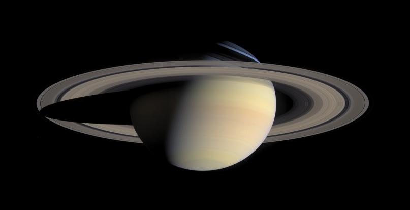
A few things you might want to fix:
- The planet textures show a lot of detail loss (blurring of what are supposed to be sharp edges).
- A solid-looking planet surface for what is supposed to be a gas giant? (or not)
- The rings. More on that below.
- The shadows are unrealistic; because the light source is the sun the planet orbits, a planet's shadow should mimick the shapes of the shadow on our own moon, e.g. be crescent shaped. There can be some glow overflow from a thick atmosphere scattering but that shouldn't extend all the way back. The shadow right now covers only a tiny dot on the planet, which isn't what really happens.
I don't like the huge aliasing of the planet's ring. You might argue that it gives it a "grainy" look that simulates the particles and chunks of stone/moons that orbit it, but it just looks bad compared to the "smooth" rings you see from images of Saturn.
(If you look carefully, you can see the rings spiral inwards. Lol
)
None.
We can't explain the universe, just describe it; and we don't know whether our theories are true, we just know they're not wrong. >Harald Lesch
Commenting on Aristo's feedback:
Yes, the green planet's surface needs to be more crisp and it needs more shadow bottom left.
I like the rings. Maybe you could make them a little more dense, especially on the left part, but keep the crispness.
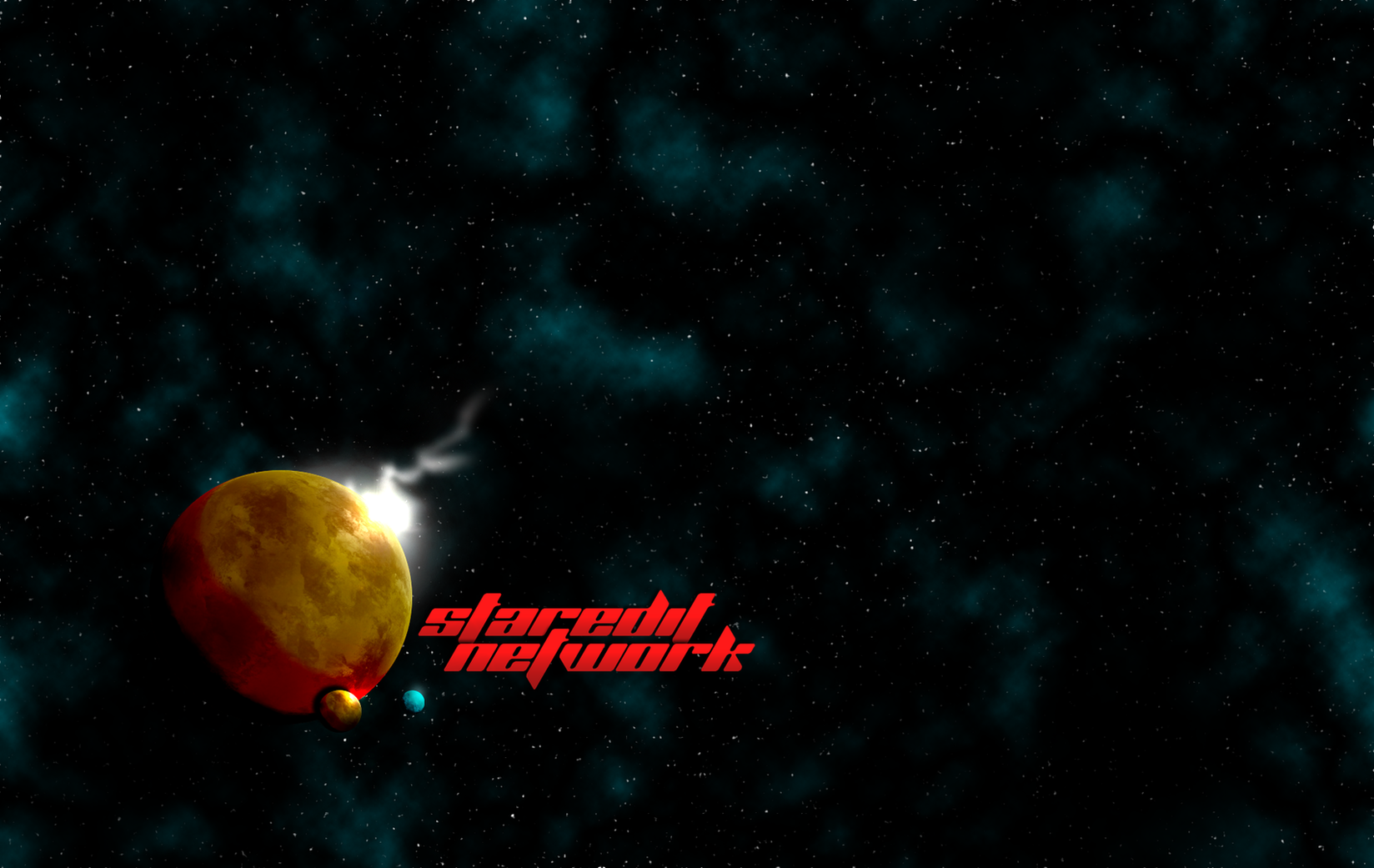
The nebulae are not looking entirely realistic. They are randomly scattered across the screen and flowing into each other which is something that you can rarely ever see in space and definitely not all the time in such a tiny fragment of visible space. Also there's too many of them. Maybe make 1-2 bigger ones and a few smaller ones because right now they are all roughly the same size. For bonus points add a bright star and/or galaxy somewhere.
Definitely like Apos's initial attempt the best. It's unbelievably hard to create a realistic space scene; most just look blocky and fake.
Though I'm a huge fan of space wallpapers, I thought I'd throw in a spin of my own: minimalism.

None.
V5? where the heck are you living?

I actually like that, good work, jamal.
Please report errors in the Staredit.Network forum.
I order you to forgive yourself!
Not sure if it helps anyone to make the planets, but I guess I can share the planet texture I made:

This is what I used on the second background I submitted.


 rockz
rockz poiuy_qwert


 Ultraviolet -- Goons were functioning like stalkers, I think a valk was made into a banshee, all sorts of cool shit
 Vrael -- thats less than half of what I thought I'd need, better figure out how to open SCMDraft on windows 11