

Please report errors in the Staredit.Network forum.

Hello


way too bright and striking.

Quote from  Devourer
Devourerway too bright and striking.

None.

Back* from the grave
Quote from Demented Shaman
Demented ShamanQuote from Devourer
Devourerway too bright and striking.
Just ask Aster
")


None.
Quote from  MadZombie
MadZombieNone.
Hello
Yup, not bad madzombie.
Please report errors in the Staredit.Network forum.
I was being sarcastic. It was to bring up how Devourer can do that with CSS. It would be so much better that way. Ask Dev to do it.
None.
Hello
the thing is that there is no need to make it css.
Please report errors in the Staredit.Network forum.
I figure it would be better as you'll get the right font. What font does sen use on the forums. Like this post? Just plain old arial?
None.
Quote from MadZombie
MadZombieI figure it would be better as you'll get the right font. What font does sen use on the forums. Like this post? Just plain old arial?
None.
Back* from the grave


I come back and I see the above posts...QQ.
EDIT: Reported for what? Trying to contribute? My bad.

ᴄʜᴇᴇsᴇ ɪᴛ!
Quote from Demented Shaman
Demented ShamanQuote


Let me know which one you guys think is better. And I mean between the two sets I made.
"Parliamentary inquiry, Mr. Chairman - do we have to call the Gentleman a gentleman if he's not one?"

ᕕ( ᐛ )ᕗ
You guys should make them the same shade of green as the rest of the forums. >_>

Just here for the activity... well not really
Quote from MadZombie
MadZombieI figure it would be better as you'll get the right font. What font does sen use on the forums. Like this post? Just plain old arial?
guy lifting weight (animated smiley):
O-IC
OI-C
"Oh, I see it"
O-IC
OI-C
"Oh, I see it"
Back* from the grave
Quote from name:Dem0nS1ayer
You guys should make them the same shade of green as the rest of the forums. >_>
Quote from poison_us
poison_usQuote from name:Dem0nS1ayer
You guys should make them the same shade of green as the rest of the forums. >_>
None.
Then i'll make the set for online/offline in a sec (though I still think it'd be better if it were css or something but I'm not a coder)
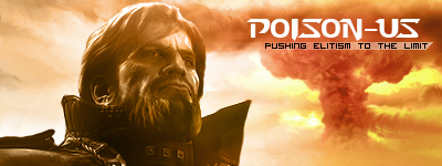
Also I don't think if you guys remember, or actually I don't remember if I posted it but I was working on a skin until I gave up because I wasn't sure how things would work in the image translation to code part. I did manage to finish this sort of banner though and was wondering if its worth a shot of making something out of it? I have the PSD for it still so i can change a lot of things. Mainly split it into images so that it can be used for those non static stretched skins or whatever.

thoughts? Text is horrible yea i know. I was going to post the version without it but I was too lazy.
Edit:


Post has been edited 1 time(s), last time on Jul 22 2010, 6:27 pm by MadZombie.
Also I don't think if you guys remember, or actually I don't remember if I posted it but I was working on a skin until I gave up because I wasn't sure how things would work in the image translation to code part. I did manage to finish this sort of banner though and was wondering if its worth a shot of making something out of it? I have the PSD for it still so i can change a lot of things. Mainly split it into images so that it can be used for those non static stretched skins or whatever.
thoughts? Text is horrible yea i know. I was going to post the version without it but I was too lazy.
Edit:
Post has been edited 1 time(s), last time on Jul 22 2010, 6:27 pm by MadZombie.
None.

:payne:


Quote from rockz
rockzwhat, GIMP?

None.
[01:35 am]
 Ultraviolet -- Vrael
Vrael shouted: NEED SOME SPORTBALL> WE GOT YOUR SPORTBALL EQUIPMENT MANUFACTURING
Gonna put deez sportballs in your mouth[2024-4-30. : 7:43 am]
 NudeRaider -- Vrael
Vrael shouted: if you're gonna link that shit at least link some quality shit: https://www.youtube.com/watch?v=uUV3KvnvT-w
Yeah I'm not a big fan of Westernhagen either, Fanta vier much better! But they didn't drop the lyrics that fit the situation. Farty: Ich bin wieder hier; nobody: in meinem Revier; Me: war nie wirklich weg[2024-4-29. : 12:52 pm]
Vrael -- if you're gonna link that shit at least link some quality shit: https://www.youtube.com/watch?v=uUV3KvnvT-w
[2024-4-27. : 9:38 pm]
NudeRaider -- UltravioletUltraviolet shouted: NudeRaider sing it brother
trust me, you don't wanna hear that. I defer that to the pros.
Members Online: l)ark_ssj9kevin, Ultraviolet
l)ark_ssj9kevin, Ultraviolet