
Magic box god; Suck it Corbo


I like these: 
These are already added, wing Zero... under settings
http://www.staredit.net/?p=settings&area=present you can change the pack.
Please report errors in the Staredit.Network forum.

We can't explain the universe, just describe it; and we don't know whether our theories are true, we just know they're not wrong. >Harald Lesch
No, Dev, those are different.
I like these: Should I replace the old ones with these?
Please report errors in the Staredit.Network forum.
If you do, use these instead, they have the right resolution:


None.
I like these: 
Should I replace the old ones with these?
someone cut them into separate images please.
Please report errors in the Staredit.Network forum.
It takes 10x longer to log in now?
None.
Shouldn't. Report this in 3 days again if that still occurs.
Please report errors in the Staredit.Network forum.
Tested: I need 2 1/2 seconds to login and I have a bad connection... 2k afaik. Dunno what this is causing, do you guys use "remember login"?
Please report errors in the Staredit.Network forum.
Tested: I need 2 1/2 seconds to login and I have a bad connection... 2k afaik. Dunno what this is causing, do you guys use "remember login"?
I checked it once or twice in the past, never seemed to do anything. I always assumed it was dysfunctional. When I go to the login page, the box is unchecked.
None.
I tested it on a comp that does use remember me and one that doesnt, same result.
None.
Here are my Torus Knot icons
Member:


||


Regular:


Veteran:


Elite:


Moderator:


Global Moderator:


Staff:


||


Preview:


I tried to make the following sense: the more convoluted, the more influence the person has to SEN. Also, lower ranks has less-shiny icons, so that you can notice the difference better in case you see a
next to an
, for example.
Some of them has two versions. I'd like the person who's going to add these to choose one of them
")
EDIT: I didn't make the admin icon. The green globe is pretty remarkable and resembles SEN itself, so I disagree on having a different admin icon for each set -- I think it's better to have the green globe for all the cases. But, if you want to, I may try to make an admin icon for this set.
Tell me if you want me to change something.
Post has been edited 4 time(s), last time on Jul 26 2010, 3:50 am by Adeon.
None.
Magic box god; Suck it Corbo
The GM and staff ones look too similar to me...
These are looking hawt actually
Please report errors in the Staredit.Network forum.
The GM and staff ones look too similar to me...
Yeah, you're right... I tried to make the staff more gold-looking, but the miniature is almost the same. It's kinda hard to work with this res.
EDIT: I swear I tried, but, apparently, I depleted every cool combination of the torus parameters and camera angles. If it gets more convoluted than Staff's, it becomes a huge mess.
So I just changed the hue.
Post has been edited 2 time(s), last time on Jul 25 2010, 11:47 pm by Adeon.
None.
WTF! when I first saw that (sexy) icon... I actually saw a donut oO
I'll add that package the next days.
Please report errors in the Staredit.Network forum.
I think the first 'member' icon should be the same color as the others and have the staff icons be white/silver
None.


 Wing Zero
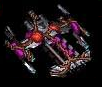


 Devourer
