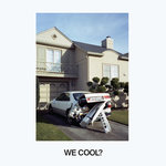
Ok so this is a website me and my friend developed, check it out and tell me what you think? Like? Don't Like? Why? Why not? We tried to make it artsy and fun but maybe it's losing functionality...
---Antherion---Thanks guys =)
(ps: i think this fits under media, but move it if this isn't the right catagory, thanks)
None.

ALL PRAISE YOUR SUPREME LORD CORBO


Baaaaw. I wanted the slider deluxe app but it's now free.
It definitely is fun at the beggining but then it gets annoying when you can't click stuff cause it goes away from you.
I don't see the "artsy", though. But you'll never hear me say something is
artistic anyway.
fuck you all
alright, i really like your website, that's really cool.
The way there's visible edges to the thing, past which everything disappears, makes it look weird.
Personally, I'm never a fan of over-fancified interfaces like this that just make it more difficult to actually
use them, but then, that's just me.
However, I'd say it's not just me that having arbitrarily moving fore- and background objects causes problems if they are not contrasting with each other at all points, as sometimes the text will find its way over a light part of the image...
There should be a limit to how slowly things can move without completely stopping, as it looks rough when stuff moves a single pixel with a recognizable pause before and after.
The background consists of two 'objects' ( the... phones? mp3 players? I have no idea what they are =P ) , as we recognize them, moving together, when everything else isn't. Stood out rather strongly to me. Kills any sort of sense of depth that might otherwise have existed. Same with the way the fuzzy effect behind the "Atherion Entertainment" and "Games" texts just 'slides over' the background objects.
Stuff seems unnecessarily far apart, requiring too much cursor movement to get between links.
The large text's font strikes me as rather too gooey for everything else seeming sharp and defined.
I have to think twice before clicking the 'back' buttons to navigate from the game pages, due to the way they overlap with the download link or whatever it is.
None.
@ Corbo: Its free?? There may be a look alike, but not the deluxe lawls
@ToA: Thanks. I'm working on adding more games and an "In Development" link to give up-to-date info on upcoming games.
@ Ez: Ya I mostly get where you're coming from. I tried to fix depth to the best I could. We tried to get images with the best contrast, but it's difficult cause we wanted the titles and text to be white to contrast with the bg. I'll consider moving the back buttons so-as to fix your caution.
None.
ALL PRAISE YOUR SUPREME LORD CORBO
I just re-read my own post and I meant it's not* free.
I wanted it

fuck you all
I just re-read my own post and I meant it's not* free.
I wanted it
Its $1 lol. I'm pretty sure that now-a-days you can ask a bum off the street for a dollar and they'll give it to you haha. Maybe i'll give you a free copy, but in return I'd need something worth at least a dollar(not an actual dollar value, just a favor worth a dollar imo).
None.
ALL PRAISE YOUR SUPREME LORD CORBO
I just re-read my own post and I meant it's not* free.
I wanted it
Its $1 lol. I'm pretty sure that now-a-days you can ask a bum off the street for a dollar and they'll give it to you haha. Maybe i'll give you a free copy, but in return I'd need something worth at least a dollar(not an actual dollar value, just a favor worth a dollar imo).
Oh, my parents just feel uneasy as to lending me their credit card to buy stuff online. They think they're gonna get scammed or something
fuck you all
Any site that opens with a loading bar = I automatically close the tab.
None.

Relatively ancient and inactive
Well, I don't automatically close it, but that loading bar instantly relegates the site to a lower level. If you remove it, it'd be better, even without the fancy effects.
Post has been edited 1 time(s), last time on Jun 14 2009, 9:38 pm by Centreri.
None.
I don't like the main page, I find it annoying. I think you should keep the links where they are, but make the iPod move.
None.
@ Syphon: Why? Would you rather it just take time to load and stay black?
@ Centreri: Alright I'll consider it =)
@ Hug: Keep the links on top of the ipod and only have the ipod move? or ipod and title?
None.
Not impressed. When you advertised this as your "web design" i expected something outside of a small flash site. Web design isn't defined by moving images in flash...
Not trying to be negative Nancy, you tried to be unique but in my opinion this shows little to no skill. For the function it appears it will be used for i guess it is okay...=P
None.
It's a cool design, sure. But as for the website itself: It's definitely lacking. I mean, I would see no reason to ever go back to it again is all I'm saying. I have a website of my own, so I know the most important thing is to get traffic to your site. I just don't see anything on your site that would really bring my traffic. (It might just be because I'm not really that into iPods... sorry if other people more into iPods think that the site is very interesting, if that's the case then i withdraw this post.)
None.
@ T-Virus: Well, that was pretty negative but nothing I didn't expect. This is just a basic outline, so it can seem bare and boring, but hopefully when I add finishing touches it will look better, and incorporate higher level skills. Mainly, the website is supposed to be creative and new, hopefully showing prospective customers I can generate unique / fun ideas.
@ Norm: Well I should imagine the target audience for this web site is someone that likes ipods/iphones. It's sole purpose is to promote the games that I make, and hopefully increase my sales. That being said, it doesn't have much more that needs to be added, so I can imagine traffic will be a little slow. (its not exactly the largest internet market)
None.
ALL PRAISE YOUR SUPREME LORD CORBO
Can you make a sexy app for the QDB? I have no idea how to make apps, is it hard? Do they have to be approved or something?
fuck you all
I think the site is awesome. It's not super fancy and complex, which it doesn't need to be, and it's still far from plain and boring. I think you hit creative and new right on the mark. I'll probably be buying the picture app.
None.
@ Corbo: QDB?? Ya they have to be approved, but as long as they are functional, 95% of apps pass the apple approval test. They only fail if its illegal, not finished, or it doesn't have any function.
@ TriggR_HappE: Glad to hear it! Thats awesome and hope you like the app =) If you do end up purchasing it, send me a pm about what you think. Also, check up on this website in like 10-14 days, I should be finished with my biggest project yet

None.
ALL PRAISE YOUR SUPREME LORD CORBO
http://corbobo.dyndns.org/index.php?pg=qdbI have it on my siggy as well. Random image <3
fuck you all
@ Syphon: Why? Would you rather it just take time to load and stay black?
@ Centreri: Alright I'll consider it =)
@ Hug: Keep the links on top of the ipod and only have the ipod move? or ipod and title?
Just the iPod move I guess. I'm not a huge fan of the whole moving thing, actually.
None.


 Corbo
Corbo Jello-Jigglers


 O)FaRTy1billion[MM] -- Brusilov
 NudeRaider -- Brusilov