It's simply a sword, a good looking one, got historical backgrounds, google it

on SEN it is simply a profile medal, no effect.
Please report errors in the Staredit.Network forum.

lul i made this a few months ago.
Let me fix it up.
None.
.png please, not animated, and these white borders obviously suck^^
Oh and, I think a font is not necessary.
Please report errors in the Staredit.Network forum.
lul i made this a few months ago.
Let me fix it up.
.png please, not animated, and these white borders obviously suck^^
Oh and, I think a font is not necessary.
God damnit... that was EXACTLY what i was working on >.>
*throws computer out of the window*
None.
I actually like those and they are now used unless someone is doing a better one.
Please report errors in the Staredit.Network forum.


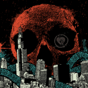
In case we feeling dark. Just basing on what David said.
(It's technically excalibur)
None.


I don't remember the font used for SEN's medals, so I took my liberty with that.
EDIT> They didn't look this green when I made them, hm.


EDIT2>
STILL TOO GREEN RAGE.

 Post has been edited 1 time(s), last time on Aug 8 2010, 9:26 pm by Aristocrat.
None.
Uh, a though decision, they are pretty awesome, I assume the community should vote.
")
Please report errors in the Staredit.Network forum.
I just want what I paid for. Moose Mug of Appreciation.
None.
Moose told me that he wants the mug of moose to be either deleted or replaced, so I replaced it, sorry.
Please report errors in the Staredit.Network forum.
If someone tells me the font used for the current SEN medals (text like "DLDB God", "SEN coder", etc.) I can replace it with that font and make it more consistent with the rest of the medals.
None.
I guess you have to ask Jamal, he made these.
Please report errors in the Staredit.Network forum.
PyMS and ProTRG developer


How about:


I have a psd so I can change colors, I kept it green to match.
Post has been edited 1 time(s), last time on Aug 8 2010, 9:58 pm by poiuy_qwert.
I like the concept but in my eyes the style you chosen is not realistic and nothing... and it doesn't fit anything on SEN, sadly. Hint: the two images can be different, so the small one fits the other medals why the other one can be similar to the other item-images.
Please report errors in the Staredit.Network forum.
PyMS and ProTRG developer
I did some minor edits to them and edited my post above. I think they would fit [now].
They're too cartoony. :-|
None.
Yea, I agree :S
Please report errors in the Staredit.Network forum.
PyMS and ProTRG developer
I think the item icons are already cartoony :S
For the store, maybe ya, but the medals definitely not
")
Please report errors in the Staredit.Network forum.


 Devourer


 Ultraviolet -- Vrael
 NudeRaider -- Vrael
