Man, im getting lazy by the minute. Seems like i can't improve my marine anymore...
I like the one drawn on oekaki. A 10!
None.
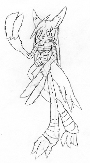
well this is a sketch i made of an zangoose anthro,she's wearing bandages by the way... ill try to color it on gimp later...
None.
Pictures of soxtuff and Pie_Sniper.
None.
Uhm.. interesting, Syphon. 7/10.
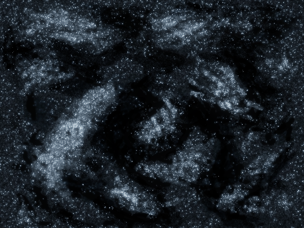
I tried making a starfield.. kind of simple, I still need to add some space dust, large stars, and maybe.. a nebula..
Let me know if it looks decent.
None.
Pretty sexy starfield... One of my friends is really good, 7th grader. He only does sketches though.
None.
for the stars i dont think clumps look very natural, maybe just a few streaks of stars as well as differnt colors.
None.
I will begin by following the rule of this thread :
1st step ( rate ) : I find the marine is not that bad, but it the lines could be more direct. What I see is only a lot of lines with no precise goal but making a big line stack to give the impression it has been work a lot. I know that its more hard to draw something with paint but you can Undo and Erase, things that I cant do with my pen  .
.
2nd step ( submit ) : This drawing was more joke than something else. When I finished it, I though it was not that bad 

This is pretty good, i like all the musles. but the face looks wierd, gj though
I did these two in art last year:
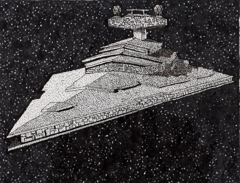
This one was made by putting hundreds of little black dots everywhere. No lines were drawn on this.
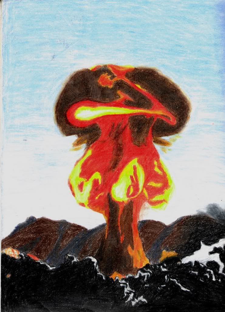
This one was pretty cool, i did it with prisma colors:
 orignial picture
I love the Star Destroyer. And the fact that you used only dots, that makes it even more amazing.
None.

My Newgrounds account picture I made
One of my fav's

My deviant art post (Korpez)
None.
My deviant art post (Korpez)
Is that a subliminal image of a chicken?

And for those who dont know what original artwork means...
artĚwork /ˈɑrtˌwɜrk/ Pronunciation Key - Show Spelled Pronunciation[ahrt-wurk] Pronunciation Key - Show IPA Pronunciation
ľnoun
1. Printing.
a. the elements that constitute a mechanical, as type, proofs, and illustrations.
b. a mechanical; paste-up.
2. the production of artistic or craft objects.
3. the object so produced.
None.
Uhm.. interesting, Syphon. 7/10.
I tried making a starfield.. kind of simple, I still need to add some space dust, large stars, and maybe.. a nebula..
Let me know if it looks decent.
Try filling in those blank spaces a bit more. They look way too empty.
I think the starfield is pretty good.
Thanks for the commentary Red2Blue, no need to tell us there has been a lot of member change and old GFX artists aren't here anymore.
None.
It looks worse without the speckles.
None.
Yes, I purposely put the speckles there because without them, it looks like a really plain/flat blend.
None.
Pretty difficult to do because there isn't any opacity control. I rather not take days of blending to achieve realistic depth, so I shortcut by slightly texturizing with the circle tool.
None.


 RIVE -- Lots of fun little nods to different works of others in the cheats too.
 Oh_Man -- so i was today years old wen i learned rebel yell starcraft mission is named after a billy idol song. makes me wonder wat other missions are named after songs