


None.


I don't believe there is any true color scheme, just a basic idea of what we have had in the past. Darker colors, such as Black, Gray, Navy, and Greens, coupled with the infamous White, make up our banners.

Quote from  JamaL
JamaL
JamaLI don't believe there is any true color scheme, just a basic idea of what we have had in the past. Darker colors, such as Black, Gray, Navy, and Greens, coupled with the infamous White, make up our banners.
") .
.None.
Just so you know...
Tomorrow, the new icons will be 150x50, png only
Tomorrow, the new icons will be 150x50, png only
None.
Quote from name:isolatedpurity
Just so you know...
Tomorrow, the new icons will be 150x50, png only
Tomorrow, the new icons will be 150x50, png only
Can't you make it like lets say 100x25 minimum then 150x50 max.
The png is fine though because png files rule
 .
.None.

Wait so you're giving us more space to be creative with?
None.


OVERWATCH STATUS GO
Wait, I have to redo them now?!
Sweet.
EDIT:
Here are some I did (and redid):


EDIT2:
If there are any requests for prior ones I've made or basic changes to these, let me know.")
Post has been edited 2 time(s), last time on Apr 13 2008, 11:47 pm by DevliN.
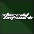
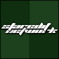
 Currently Working On:
My Overwatch addiction.
Sweet.
EDIT:
Here are some I did (and redid):
EDIT2:
If there are any requests for prior ones I've made or basic changes to these, let me know.
Post has been edited 2 time(s), last time on Apr 13 2008, 11:47 pm by DevliN.
Currently Working On: My Overwatch addiction.
Im diggin the 1st one, makes Oo look evil! Plus I like the 3rd for some reason...
None.
Quote from T-MaStAA
Im diggin the 1st one, makes Oo look evil! Plus I like the 3rd for some reason...
.I suggest we use it now!
None.
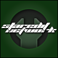
Hmm devlin is it possible to make the 1st one a little bigger without messing up the badassness? There seems to be allot of empty black space on each side of the writing.
None.
OVERWATCH STATUS GO
Hmm yeah I can try to enlarge it some more. I kinda like the space on the sides, though.
EDIT:
Better?
Currently Working On:
My Overwatch addiction.
EDIT:
Better?
Currently Working On: My Overwatch addiction.
Quote from  DevliN
DevliNHmm yeah I can try to enlarge it some more. I kinda like the space on the sides, though.
EDIT:
Better?
EDIT:
Better?
.Sorry devlin has just me wet myself with his skills.
None.

Quote from T-MaStAA
Seems a little evil though no?
Anyways, Dev's are definately the best. >.>
None.
Quote from DevliN
DevliNDude! That is awesome!!! Maybe put like a ghost in the background or beside the lettering add something else to it other than that... Just a thought, but other than that, it looks cool!

None.
OVERWATCH STATUS GO
Quote from Twitch
TwitchOk can we please put this as our icon already or do I have to get solar to ban you to get work one .
Sorry devlin has just me wet myself with his skills.
.Sorry devlin has just me wet myself with his skills.
Quote from Rawr
Isn't Clan Oo Evil? loljk
Anyways, Dev's are definately the best. >.>
Anyways, Dev's are definately the best. >.>
Quote from HavoK
Dude! That is awesome!!! Maybe put like a ghost in the background or beside the lettering add something else to it other than that... Just a thought, but other than that, it looks cool!
Currently Working On: My Overwatch addiction.

ALL PRAISE YOUR SUPREME LORD CORBO
You people are just jealous of our Mudkip logo.
You can't be better than us, face it
Just kidding, I kinda like devlin's first one or last one.
I definately like the last one better on a second thought.
Don't make it too big, though. I think 100x25 would just be fine for icons.
You can't be better than us, face it
Just kidding, I kinda like devlin's first one or last one.
I definately like the last one better on a second thought.
Don't make it too big, though. I think 100x25 would just be fine for icons.
fuck you all
Quote from  Corbo
Corbo
CorboYou people are just jealous of our Mudkip logo.
You can't be better than us, face it
Just kidding, I kinda like devlin's first one or last one.
I definately like the last one better on a second thought.
Don't make it too big, though. I think 100x25 would just be fine for icons.
You can't be better than us, face it
Just kidding, I kinda like devlin's first one or last one.
I definately like the last one better on a second thought.
Don't make it too big, though. I think 100x25 would just be fine for icons.
.The others are more into chickoritas .None.
Btw, IP is updating our forum logo by next week i think to the sc2 looking character one that Devlin did.. Congrats for devlin!
None.
Quote from Snipe
Btw, IP is updating our forum logo by next week i think to the sc2 looking character one that Devlin did.. Congrats for devlin!
None.

None.
WTF I think we made it clear that most of us want the evil one...
None.
[2024-5-20. : 4:03 am]
 O)FaRTy1billion[MM] -- below the minimap should be a thing that says "Overlay Settings" with a little + button in the corner, press the + to expand it, uncheck Use Defaults, then change "Tile Overlay" to "Height"
[2024-5-20. : 3:57 am]
Sylph-Of-Space -- It would be so so so nice if SCMDraft had some kind of dedicated "walkability" view for the tilesets.
Members Online: 9miae931gh2, Crayf601,  NudeRaider
NudeRaider