We can't explain the universe, just describe it; and we don't know whether our theories are true, we just know they're not wrong. >Harald Lesch


First of all I want to make clear that everything that I used is taken from this desktop background:
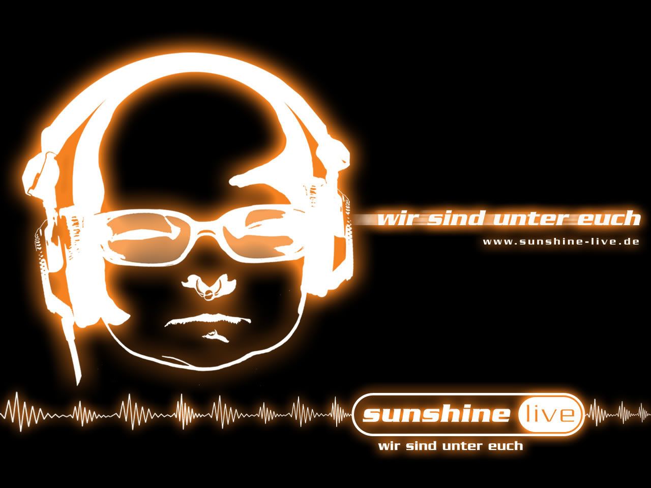
I want you to rate the quality of my assembling and modifying.
The picture I'm gonna present is meant as a Firefox Persona (for those who don't know it's a right-aligned browser background and is supposed to have 3000x200 pixels, that's why I have a lot of empty space - it will rarely be seen by anyone).
I want to publish it for any fans of that German radio station Sunshine Live so I'd like you, SEN, take a look at it and tell me if I need to fix something before I do that. Here you go:
 Post has been edited 4 time(s), last time on Aug 9 2010, 7:04 pm by NudeRaider. Reason: image update
Looks nice!
Tempted to switch my persona to that...
However this SCII persona is blue...
If you had it with different colors i would surely take one

I would take it if it was the same color as your avatar
None.
It's pretty hawt, nude, however, I personally would like to see something at the bottom edge as well. But that's just me.
Please report errors in the Staredit.Network forum.
We can't explain the universe, just describe it; and we don't know whether our theories are true, we just know they're not wrong. >Harald Lesch
Thanks.
My avatar is the exact same babyface as in the persona. Except instead of the grey SEN background it has black background. It's partly transparent.
So you'd like all of the orange to become blue? It's no problem to make a 2nd version like that.
")
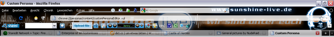
Unless you have big icons and more than 4 bars (menu, nav, tabs, bookmark, +X) you won't see that there's only blackness further down. The visible area is usually somewhere between 75 and 140 pixels vertically.
i only have the navbar and the tab bar enabled so its all good...
NudeRaider: Making FF look good one persona at a time
None.
Show me screenshots with toolbar buttons (normal-sized and small-sized) overlaid. Then I'll judge it. Problem with most Personas is, they look nice by themselves, but when you actually use them, you see barely any of the image and your own buttons are in the way.
None.
We can't explain the universe, just describe it; and we don't know whether our theories are true, we just know they're not wrong. >Harald Lesch
 Post has been edited 2 time(s), last time on Aug 9 2010, 7:02 pm by NudeRaider.

Relatively ancient and inactive
Eh. I suppose it could be alright for what you're trying to achieve, but I wouldn't use it. It's contrasty.
None.
We can't explain the universe, just describe it; and we don't know whether our theories are true, we just know they're not wrong. >Harald Lesch
Eh. I suppose it could be alright for what you're trying to achieve, but I wouldn't use it. It's contrasty.
You are right. After critically looking at it and actually using it, I didn't like it either.
Update:
 Post has been edited 1 time(s), last time on Aug 9 2010, 7:02 pm by NudeRaider.
i would like either version as all i use is the address bar...
None.
Move the main part down a little so the text doesn't clash with the address bar.
None.
I've never understood personas.

I don't even have 50 pixels of toolbars. It's 25 if I've only tab open.
"Parliamentary inquiry, Mr. Chairman - do we have to call the Gentleman a gentleman if he's not one?"
We can't explain the universe, just describe it; and we don't know whether our theories are true, we just know they're not wrong. >Harald Lesch
Move the main part down a little so the text doesn't clash with the address bar.
It doesn't do that for FF 3.6. Check the full screenshots from yesterday.
The updated screenshot is from FF 3.5 which makes the title bar bigger for some reason. But for now I have to use FF 3.5 because local Personas don't work in 3.6 yet due to a bug.
I don't even have 50 pixels of toolbars. It's 25 if I've only tab open.
Never said you were the usual user.
The visible area is usually somewhere between 75 and 140 pixels vertically.
Also, rockz, I'm curious, how did you get those icons to the left of your menu? Those are bookmarks right?
Is there any addon that allows custom buttons to be added?
Bookmark toolbar is put up there, all items in the toolbar have no name (just a favicon).
By the way I like it, and it looks good, but will have a very specific use. I doubt anyone other than the people you tell about it will use it. That's just the way things are.
"Parliamentary inquiry, Mr. Chairman - do we have to call the Gentleman a gentleman if he's not one?"
Found a better avatar for you nude xD
http://www.youtube.com/user/godfather556look at the blue baby with headphones and glasses LOL
None.
We can't explain the universe, just describe it; and we don't know whether our theories are true, we just know they're not wrong. >Harald Lesch
Yeah that's one of the other background pictures Sunshine Live made. I have this as skin for winamp.
Imo this style is better suited for light colored forums, while the glowy one I'm using really shines on dark backgrounds.
Might make a Persona based off this one too since I'm a fan of light blue themes. We'll see.
Alright, time to upload I guess. Let's see if they accept it or if they reject for not being my legal property...
Yeah that's one of the other background pictures Sunshine Live made. I have this as skin for winamp.
Imo this style is better suited for light colored forums, while the glowy one I'm using really shines on dark backgrounds.
Might make a Persona based off this one too since I'm a fan of light blue themes.
I am also a fan of light blue themes
None.
I think most people would agree that minimalistic is the way to go. That's way too distracting, especially how the text leaks into text input boxes.
None.
We can't explain the universe, just describe it; and we don't know whether our theories are true, we just know they're not wrong. >Harald Lesch
Yes, it probably is too distracting but I had this theme in mind so that's what I made of it. But the text boxes are fine, there's barely any distraction or readability problem because of the strong white overlay of the boxes.
However should I choose to make a light blue version eventually it should be much less conspicuous.
Anyway, here's the final version approved by Mozilla and available to anyone:
http://www.getpersonas.com/en-US/persona/269749