


We can't explain the universe, just describe it; and we don't know whether our theories are true, we just know they're not wrong. >Harald Lesch


now we're talking


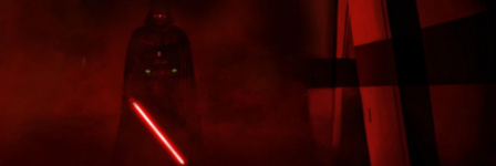
Not sure if I got the "brightness" correct but people seem to like it darker anyway. PSD of me trying to recreate what I did posted so that other people may edit it.
Attachments:
None.

Hello
I think that it should be colored red, no?
Please report errors in the Staredit.Network forum.


These are the best. MadZombie's suck. They have a crappy metallic look that doesn't even fit the look of the skin.
None.
Hello
You've once again got a point, but yours still are looking awkward, so therefore MZ's are still better. On top of that, it doesn't matter whether you think that MZ's sucks, it's rather the choice of the entire community.
Please report errors in the Staredit.Network forum.
Quote from  Devourer
DevourerYou've once again got a point, but yours still are looking awkward, so therefore MZ's are still better. On top of that, it doesn't matter whether you think that MZ's sucks, it's rather the choice of the entire community.
None.


None.
Hello
Lets see, it's basically White or Black font on a one-color background with a border which is way too big. Change that and it could be good. Maybe add a better font as well.
EDIT: No, I do not consider the border as background.
EDIT: No, I do not consider the border as background.
Please report errors in the Staredit.Network forum.
Quote from Devourer
DevourerLets see, it's basically White or Black font on a one-color background with a border which is way too big. Change that and it could be good. Maybe add a better font as well.
None.

Back* from the grave
Whoa, I'ma try my hand at *making my own, rather than editing* now.
Quote from Devourer
DevourerLets see, it's basically White or Black font on a one-color background with a border which is way too big. Change that and it could be good. Maybe add a better font as well.
EDIT: No, I do not consider the border as background.
EDIT: No, I do not consider the border as background.
None.
We can't explain the universe, just describe it; and we don't know whether our theories are true, we just know they're not wrong. >Harald Lesch
I think Devo just wants fancy stuff like the on/off button before the Online/Offline text and the "scanner sweep" before Contact in MZ's. And a gradient.
It's a different style, I don't see why you have to fight over it. There will be different skins with different buttons and styles. Maybe we end up using both.
It's a different style, I don't see why you have to fight over it. There will be different skins with different buttons and styles. Maybe we end up using both.
Hello
And maybe you can make your own pink troll'd layout for SEN in which you can include your own buttons 
Please report errors in the Staredit.Network forum.
Quote from Devourer
DevourerAnd maybe you can make your own pink troll'd layout for SEN in which you can include your own buttons
None.
Hello
I see, you are really thinking that we will accept a rosa and troll'd skin.
However, I will send ya the files once the new skin system is completely working (testing this with devlin while redoing epic skin). You need to know css, html, php (just the major syntax) and maybe some JS.
However, I will send ya the files once the new skin system is completely working (testing this with devlin while redoing epic skin). You need to know css, html, php (just the major syntax) and maybe some JS.
Please report errors in the Staredit.Network forum.
Quote from Devourer
DevourerI see, you are really thinking that we will accept a rosa and troll'd skin.
None.
Back* from the grave
I'd love to remake Carbonite, or at least have fixed-width goodness. ")
I'm surprised devilesk didn't just make an online/offline button based on the fast reply button if he wanted it to be a solid color that fits with the board. Sheesh.
My 2 cents. The bevel sucks. It gives it a 3D look that this board doesn't have. It's flat. I think it would look better without a bevel border.
Quote
you can't even tell me how mine are awkward.
None.
Quote from  MadZombie
MadZombieQuote
you can't even tell me how mine are awkward.
None.
Updated color of version 2


None.
[03:27 am]
m.0.n.3.y -- Can't upload maps to the DB. Error says "The action you have performed caused an Error". Any word?
[2024-4-20. : 11:29 pm]
Zoan -- Oh_ManOh_Man shouted: yeah i'm tryin to go through all the greatest hits and get the runs up on youtube so my senile ass can appreciate them more readily
You should do my Delirus map too; it's a little cocky to say but I still think it's actually just a good game lol[2024-4-20. : 8:20 pm]
 Ultraviolet -- Goons were functioning like stalkers, I think a valk was made into a banshee, all sorts of cool shit
[2024-4-20. : 8:20 pm]
Ultraviolet -- Oh wait, no I saw something else. It was more melee style, and guys were doing warpgate shit and morphing lings into banelings (Infested terran graphics)[2024-4-20. : 8:18 pm]
Ultraviolet -- Oh_ManOh_Man shouted: lol SC2 in SC1: https://youtu.be/pChWu_eRQZI
oh ya I saw that when Armo posted it on Discord, pretty crazy[2024-4-20. : 8:09 pm]
 Vrael -- thats less than half of what I thought I'd need, better figure out how to open SCMDraft on windows 11
Members Online: m.0.n.3.y, Ultraviolet
Ultraviolet