Bump! I've gotten better since I last started this thread.
")
It's only been a year and a half...so one would hope so.
Give me something to draw! :3
Draw the incredibly masculine Professor Snape standing victorious atop a sea of cheesey salamanders and fat interns, exuding testosterone like a manly aura.
Reference image;

Imagine it as like one of those Conan the Barbarian kind of logo things, but with Professor Snape as seen in saucy fanfics.
Show them your butt, and when you do, slap it so it creates a sound akin to a chorus of screaming spider monkeys flogging a chime with cacti. Only then can you find your destiny at the tip of the shaft.
Draw a mushroom overlooking a river that's in the background
"If a topic that clearly interest noone needs to be closed to underline the "we don't want this here" message, is up to debate."
-NudeRaider
Draw a mushroom overlooking a river that's in the background
Oh good one...
Immortal!
Kame draw a mushroom overlooking a river that's in the background.
None.
Draw the Umbrella Corp logo in a dark, gritty style on a black background.
Draw the incredibly masculine Professor Snape standing victorious atop a sea of cheesey salamanders and fat interns, exuding testosterone like a manly aura.
Reference image;

Imagine it as like one of those Conan the Barbarian kind of logo things, but with Professor Snape as seen in saucy fanfics.
Draw the Umbrella Corp logo in a dark, gritty style on a black background.
No.

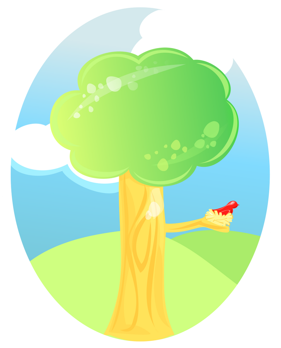
Draw a tree

Up Next:
Draw a mushroom overlooking a river that's in the background
Yay nice tree
But why does the tree have shines on the top left and bottom right

None.
I was trying a new style.

I thought it looked uneven without something else, but when I made the freckles darker than the background it looked worse, so I made it a little lighter but not as light as the top.
I was trying a new style.
I thought it looked uneven without something else, but when I made the freckles darker than the background it looked worse, so I made it a little lighter but not as light as the top.
Oh that makes sense.
Usually you'd solve that by moving your light source a little bit. Yours is just left, but if you make left and upward the bottom portion of the entire tree can be darker, making it look more full and round. Should also just make the bottom portion of the tree darker overall to give it more depth.
The color of the tree trunk sort of blends into the background hill, might want to contrast that a bit. Same goes for the birds nest blending into the tree.
You also have a lot of edges coming together right around the bottom of the tree branch where it connects to the tree. It confuses the eye a little bit with the branch touching the edge of the tree touching the edge of two hills. Ideally you'll want more blue sky in the middle of all those edges to create stronger negative space for the eye to be able to discern the difference between the different shapes easier. This also goes for the edge of the end of the tree branch below the bird. All of this can be solved by moving the horizon line (the top of the hills) down just a little bit to about 1/3 of the way up the canvas. This follows the rule of thirds and solves a lot of composition issues
The left cloud's edge is also following along the edge of the tree. Ideally you'll have the cloud's edge be more at a 90 degree angle intersecting behind the tree, as compared to being parallel, like the top cloud. This is so the eye can discern between the shapes without strain.
If these are hard to understand I might have explained it badly... If you want you can PM me the psd and I can make some simple changes, and you can see the difference

None.
That actually makes a lot of sense xD Thank you Cecil.
I wasn't really sold on how the clouds ended up either, but between that and before I had put up the hills it looked really barren.
It isn't a .psd, it's a .svg. You should still be able to open in in photoshop, but I think it'll merge my pieces unless you have a vector program.
Draw the Umbrella Corp logo in a dark, gritty style on a black background.
No.
So much for my new avatar

you've asked for it before Azrael, and I never could appease you.

besides...I hate GIMP and that's the only way I have for gritty.
Draw an anthropomorphic bucket of popcorn eating a bucket of humans.
you've asked for it before Azrael, and I never could appease you.
That was a much different avatar, it had words and stuff! As for the second part, I think I just wasn't descriptive enough
besides...I hate GIMP and that's the only way I have for gritty.
Oh, well if that's the reason
Draw an anthropomorphic bucket of popcorn eating a bucket of humans.
Win.
Here's your mushroom overlooking a river
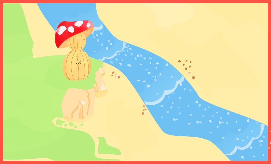
I'm not that happy with this. I might entirely redo it.
I'll try to draw this next:
Draw an anthropomorphic bucket of popcorn eating a bucket of humans.
Here's your mushroom overlooking a river
I'm not that happy with this. I might entirely redo it.
I'll try to draw this next:
Draw an anthropomorphic bucket of popcorn eating a bucket of humans.
Much nicer composition this time around. Good job! You just need to learn a little color theory, use more contrasting colors and a wider range of shades/values, and look up the rule of thirds!
I know a little about color and art, and since I'm making a lot of the art for our game I can share what I know with the rest of you. Hopefully it can help someone.
When picking colors for a theme, you want to generally use one color as your base. From there you choose a complimentary color as your highlight color, which you use just for highlights of specific things. A complimentary color is one that is at the opposite end of the color wheel.
For example this webpage uses white as it's base color, and black to highlight text. It also uses blue link text which compliments the yellow smiley faces in the default avatars. This might have been unintentional but it works anyway. If you want more variety in your base colors, you can use a set of base colors by using a split-complimentary set of colors. So instead of blue and yellow you could use two colors adjecant to blue on the color wheel. You could mix some red into your blue for one color, and an equal amount of green to create your other.
http://www.tigercolor.com/Images/SplitComplementary.gif - Split complimentary
Complimentary colors are also a great tool for creating shadows and depth perception. Mixing a color with its compliment can give you a darkening effect of your color, which is great for color gradients that tend towards a shadow.
Natural day and night compliments are blue/purple for night and yellow/orange for day. You can use this knowledge to create color palettes pretty easily. I did this for making a lot of sprite images. This is what I meant by hue shifting.
http://browse.deviantart.com/?qh=§ion=&q=pixel+art#/d320ykn - Color palettes with day and night complimentaries
http://ostwyn.deviantart.com/art/TUTORIAL-Texture-Color-Theory-188959239?q=boost%3Apopular%20pixel%20art%20tutorial%20texture&qo=5 - Good example of hue shifting on here
Annnnddd that's about all I know. Oh one last thing in the color picker whenever you're picking colors in photoshop, stay away from the center of the picker. The center is low on saturation and if you use a bunch of colors from that region your colors will be very dull. You'll want to grab colors mostly from the edges of the square color picker.
None.
Look what I forgot about!

It is a good thing this topic got bumped.

None.


 IskatuMesk
 Azrael


 Ultraviolet -- Vrael
 NudeRaider -- Vrael