Staredit Network > Forums > Media, Art, and Literature > Topic: LOL SIGNATURES
LOL SIGNATURES
Jun 30 2010, 9:04 pm
By: MadZombie  

Jul 1 2010, 1:29 pm MadZombie Post #21


I couldnt find a suitable place to put text and I'm too lazy to look for more fonts and stuck to my 2-3 fonts :C. Since you make sigs too I'll upload the PSD also but it's only going to be the "lite" version (2mb) as the full PSD with the full images I used is would take forever for me to upload on my crap internet (64mb~).

I don't know if it looks like I put a lot of time into but I didn't lol... It was like 5~ min in photoshop because I was too lazy to actually go and cut out the image from it's bg so I abused the "Lighten" blend. In sig making you don't make art (not until you get to pro level D:) you just manipulate it. At least thats how I'd describe what I did.

Edit: Haw, I didnt realise I didn't say who it was for. It's for Aristo :hurr:

Attachments:
AristoSiglite.psd
Hits: 2 Size: 2116.92kb

Post has been edited 2 time(s), last time on Jul 1 2010, 2:51 pm by MadZombie.


None.

Jul 1 2010, 2:44 pm BeDazed Post #22


Quote
That has 113 layers
That blew my mind. What an inefficient way to get a result that looks just like overlay. Try color adjustments and overlay. It probably won't take you... 113 layers.
Also, I don't really recognize your sense of artistry, but most high level signature makers I know would recommend against having borders like yours. They ruin signatures.

And making art is for people who've professionally taken art courses. Or at least have taken courses that involve art making using photo editing programs.


None.

Jul 1 2010, 2:46 pm Demented Shaman Post #23


Quote from BeDazed
Quote
That has 113 layers
And making art is for people who've professionally taken art courses. Or at least have taken courses that involve art making using photo editing programs.
I took a computer graphics art course!


None.

Jul 1 2010, 3:07 pm Aristocrat Post #24


Quote from BeDazed
Quote
That has 113 layers
That blew my mind. What an inefficient way to get a result that looks just like overlay. Try color adjustments and overlay. It probably won't take you... 113 layers.
Also, I don't really recognize your sense of artistry, but most high level signature makers I know would recommend against having borders like yours. They ruin signatures.

And making art is for people who've professionally taken art courses. Or at least have taken courses that involve art making using photo editing programs.

If you think it looks like overlay then you have perception problems; there is a huge difference between slapping on a random blending option and calling it a day, and re-touching parts of the picture meticulously with adjustment layers to make it look the way you want.

Making art is for people who want to. No law or social maxim out there bans people without professional artistic experience from drawing.

http://en.wikipedia.org/wiki/Hobby

l2tolerate.


None.

Jul 1 2010, 3:50 pm MadZombie Post #25


I'm sorry.


None.

Jul 1 2010, 8:00 pm Aristocrat Post #26


DOUBLE MENGSK :hurr:

Probably get rid of that white gradient and blur your stock layer a little; won't be half bad.


None.

Jul 1 2010, 8:22 pm MadZombie Post #27


White gradient layer? Uh... the white 'smoke' to the left or the white triangular figure to the right?

I use to whore the blur tool on everything for depth or motion. After my resolution change it never looks quite right. Sigh.


None.

Jul 1 2010, 8:33 pm Aristocrat Post #28


The giant white stripe on the left side; looked like a line gradient ;o


None.

Jul 1 2010, 10:21 pm BeDazed Post #29


Quote
If you think it looks like overlay then you have perception problems; there is a huge difference between slapping on a random blending option and calling it a day, and re-touching parts of the picture meticulously with adjustment layers to make it look the way you want.
No. It doesn't matter how much work you put into it. It looks like overlay no matter how you look at it.

Quote
Making art is for people who want to. No law or social maxim out there bans people without professional artistic experience from drawing.
Obviously. But most people who do are professional. Frankly, the skill required to make fine digitally created art is considerable. There aren't many amateur artists capable of creating their own art. Plus, most fine arts undergo rigorous sketching and over-sketching. Most amateurs do not have the patience nor the time to do this.


None.

Jul 2 2010, 12:24 am Aristocrat Post #30


Quote from BeDazed
There aren't many amateur artists capable of creating their own art.

http://www.deviantart.com/


None.

Jul 2 2010, 12:26 am CecilSunkure Post #31


Quote from Aristocrat
Probably get rid of that white gradient and blur your stock layer a little; won't be half bad.
True this.

Also, go and learn a little bit of formal art sense, mainly composition and color theory. Signature making, at our level, is going to be almost purely composition and color theory.

Read this post first off. Then read this page and watch the video here.

There is more info than you could ever want on the internet about composition and color theory, go use a little of it!

I'll try to critique this piece (you should read my critique before and after you read through the information I gave you):


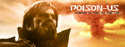
You have three focal points on this picture. Here they are:


The letters also draw the eye slightly. Now, taking the rule of thirds into consideration, you should have created your focal points where the thirds lines intersect, and you want the focal points to be something that the eye would want to look at. Your large white lightings and large white lines aren't really at all attractive to the eye, and just distract from the face of that dude. You also have too many lines that are going straight up and down, or near straight up and down, and do nothing but distract the eye and clutter the image.

Your use of color is okay, but you have too much white and not enough blue. Blue is the primary color in your picture, and yellow is your compliment. The yellow is too similar to white to be used like you used them, and they just drown out your picture. You should have used much, much more blue, and much less yellow.

One thing you need to know is that you can manipulate and control where the eye goes when you create an image. Once you realize and learn to do this, being able to do so becomes invaluable.

Sadly, I don't study art anymore as I'm in DP for CS :cecil:


Quote from BeDazed
Quote
Making art is for people who want to. No law or social maxim out there bans people without professional artistic experience from drawing.
Obviously. But most people who do are professional. Frankly, the skill required to make fine digitally created art is considerable. There aren't many amateur artists capable of creating their own art. Plus, most fine arts undergo rigorous sketching and over-sketching. Most amateurs do not have the patience nor the time to do this.
Bedazed is right. Nobody here has the artistic ability or the motivation to create high-level art. The closest people to doing so are the few that posted up some decent art in the media/art/lit forums. I don't know of anyone else around this site that even studied art in a semi-formal and rigorous manner like I did -if you have and you are reading this then you should show your art, like, right now. I love seeing peoples' art.


None.

Jul 2 2010, 1:37 am MadZombie Post #32


I would have preffered you critiqued the other sigs as I did know I messed up real bad. I even apologized for it. So please can you also critique the other ones instead of my worst? Well I guess that would be best but I already understood I messed up so this is an isolated case. k thx :3

Personally I thought the color was horrible. Like it didn't even make sense. Where I put the white 'smoke' in the left completely ruins the lighting the Mengsk stock had. The light sources was supposed to come from behind him and yet I placed it right in front of him.

I have a problem with 'installing' fonts on my computer after messing with the regional language packs or whatever on my computer. I had a ton of fonts but for some reason only 3-4 showed up for use on my font list in photoshop. Weird shit bro. I hear a lot of people saying "Oh shit bro don't put text in sigs man. That completely ruins a sig maaaan. DUN DO IT" Personally I believe that using text in a sig can make or break a sig. If used it can sometimes greatly boost the sigs overall appearance. I'm not saying the only way to make a sig look good is to ALWAYS put texts on it but I'm saying that saying "don't EVER use text" is wrong.

I've been trying to go with this Chaotic messy style that I've seen used back when I used to really go out of my way to learn how to "sig" in places like Game Renders and planet renders and other boards reading tuts and gathering resources at what ever chance I could get. I'm only happy with how the part on the right came out. I wish I saved the PSD just to "extract" that part to build on it to make something that would please me.


When I was 14~ I thought that if I got good at sig making I could like turn this into a career but as I got older I realized making sigs isn't actually ... much. I tried making LP's and at first I thought I had good footing with the sig knowledge but I jsut didn't have the imagination to make anything out of myself. And I kept getting the BSoD and had to reformat (4 times) and kept losing everything and I just raged quit. That was like a year and a half ago. I'm running out of free time and it's too late to continue "learning" ony my own with the help of the internet I believe. At least to get to the level that I want to be at. I kinda wished I was doing it for a living(as bad as the field is) doing tablet work and designing for real. Also wanted to learn to do 3D modeling and web site design. Shit would have been so cash.
Collapse Box


BUT OWELLZ. I'm go work minimum wage anyway k thx.


None.

Jul 2 2010, 1:45 am poison_us Post #33

Back* from the grave

Quote from MadZombie
I would have preffered you critiqued the other sigs as I did know I messed up real bad. I even apologized for it. So please can you also critique the other ones instead of my worst? Well I guess that would be best but I already understood I messed up so this is an isolated case. k thx :3

Personally I thought the color was horrible. Like it didn't even make sense. Where I put the white 'smoke' in the left completely ruins the lighting the Mengsk stock had. The light sources was supposed to come from behind him and yet I placed it right in front of him.

I have a problem with 'installing' fonts on my computer after messing with the regional language packs or whatever on my computer. I had a ton of fonts but for some reason only 3-4 showed up for use on my font list in photoshop. Weird shit bro. I hear a lot of people saying "Oh shit bro don't put text in sigs man. That completely ruins a sig maaaan. DUN DO IT" Personally I believe that using text in a sig can make or break a sig. If used it can sometimes greatly boost the sigs overall appearance. I'm not saying the only way to make a sig look good is to ALWAYS put texts on it but I'm saying that saying "don't EVER use text" is wrong.

I've been trying to go with this Chaotic messy style that I've seen used back when I used to really go out of my way to learn how to "sig" in places like Game Renders and planet renders and other boards reading tuts and gathering resources at what ever chance I could get. I'm only happy with how the part on the right came out. I wish I saved the PSD just to "extract" that part to build on it to make something that would please me.


When I was 14~ I thought that if I got good at sig making I could like turn this into a career but as I got older I realized making sigs isn't actually ... much. I tried making LP's and at first I thought I had good footing with the sig knowledge but I jsut didn't have the imagination to make anything out of myself. And I kept getting the BSoD and had to reformat (4 times) and kept losing everything and I just raged quit. That was like a year and a half ago. I'm running out of free time and it's too late to continue "learning" ony my own with the help of the internet I believe. At least to get to the level that I want to be at. I kinda wished I was doing it for a living(as bad as the field is) doing tablet work and designing for real. Also wanted to learn to do 3D modeling and web site design. Shit would have been so cash.
Collapse Box


BUT OWELLZ. I'm go work minimum wage anyway k thx.
QQ.

It's not a bad signature, but cecil's right about the white and yellow combination. Aristo's has a bar across the hair that extends from the text, a funky looking cloud (would look better with just the nuke, IMO), and a couple other flaws, so don't get too down on yourself. Nobody expects professional, art exhibit-quality work.


Jul 2 2010, 1:52 am MadZombie Post #34


What? I'm not saying I suck ass or anything. I think we all agree the sig is not good. I'm not QQing over that. I'm QQing over what could have been if I changed my focus in life sooner.

I just want C&C on the other sigs too and not just on one.


None.

Jul 2 2010, 2:08 am Aristocrat Post #35


My sig: too many light sources although it could make it look better if used in a different way. StarBlue sigs are decent, cut down on the lighting, again. Make sure contrast and saturation is good.

(Just take art as a hobby; I'm a math/tech/sciencey person but I do art in my spare time anyways. Pick up 3DSMax and try modeling and character animation, then switch over to Maya if you like it. The easiest thing to do at first would be animating untextured 3D models and checking your flow: does it look realistic? Is it believable 3D? Then move on to more complicated things.

Poison, I can't remove the cloud from the nuke ;o. The nuke was produced partly with the smudge tool and thus has indeterminate top and bottom borders.

In unrelated news, replacing marines with Hatsuke Miku is the lulziest thing possible in SC2. No, srsly.


None.

Jul 2 2010, 3:13 am BeDazed Post #36


My quick attempt at a signature. It's been a while since I made one. Anyone want?


None.

Jul 2 2010, 3:24 am Aristocrat Post #37


Bottom-right corner :massimo:

It look like stock with a layer of white brushing filtered; actually, now that I think about it, make a brush set with that kind of effect; might be handy for other DA people :).


None.

Jul 2 2010, 3:49 am BeDazed Post #38


This wasn't done through white brushing :/ Mostly smudge, blur then linear, sharpen and repeat. The thingy around the Balrog is pen tool.
.. The bottom right looks bad. It's not that hard erasing it though.


None.

Jul 2 2010, 4:02 am Fire_Kame Post #39

wth is starcraft

Go ahead...make me one with kiwis and the motto located...


Jul 4 2010, 12:42 am CecilSunkure Post #40


Quote from MadZombie
I'm QQing over what could have been if I changed my focus in life sooner.
It's never too late. I could be QQing over my own position in life, but truly, all we can do is play the hand we are dealt to the best of our abilities; you can't choose your hand. So instead of QQing over what could have been, you best make best out of what you have now, and use what you have now to your full advantage.

Quote from MadZombie
I just want C&C on the other sigs too and not just on one.
I'm getting really busy, I will if I have time.

Quote from CecilSunkure
Sadly, I don't study art anymore as I'm in DP for CS :cecil:
Well, actually, there is a very good chance I'll be pursuing an artistic career. We'll see what happens.


None.

Options
  Back to forum
Please log in to reply to this topic or to report it.
Members in this topic: None.
[10:34 am]
NudeRaider -- SEN doesn't rely on spammers initiate its sleep cycle. It hat fully automated rest and clean-up phases. Please understand that this is necessary for the smooth operation of the site. Thank you.
[03:45 am]
Sylph-Of-Space -- Does the shoutbox get disabled when there's spammers?
[2024-5-17. : 6:47 am]
NudeRaider -- lil-Inferno
lil-Inferno shouted: nah
strong
[2024-5-17. : 5:41 am]
Ultraviolet -- 🤔 so inf is in you?
[2024-5-17. : 4:57 am]
O)FaRTy1billion[MM] -- my name is mud
[2024-5-17. : 4:35 am]
Ultraviolet -- mud, meet my friend, the stick
[2024-5-16. : 10:07 pm]
lil-Inferno -- nah
[2024-5-16. : 8:36 pm]
Ultraviolet -- Inf, we've got a job for you. ASUS has been very naughty and we need our lil guy to go do their mom's to teach them if they fuck around, they gon' find out
[2024-5-16. : 5:25 pm]
NudeRaider -- there he is, right on time! Go UV! :D
[2024-5-16. : 5:24 pm]
lil-Inferno -- poopoo
Please log in to shout.


Members Online: 9adrianc822ya0, 9jordane423wB4