This is only my sixth or seventh sig, but here goes:
I know the proportions are weird, but I'm too lazy to crop and scale it to a normal sig size.
EDIT: Another one, quick and brutal but looks okay:

EDIT: Moar.

YES, IT'S ANOTHER EDIT: Sticky?
Post has been edited 3 time(s), last time on Sep 23 2007, 5:15 am by Doktor Shotgun.
None.
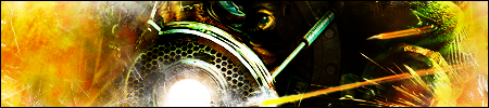
first one wouldve came out amazing if u were to take out the scan lines on the right part of the marine

cuz u got the depth looking real good
and the second one is simple and to the point so ilike that oen too
im not a big fan of the third one
---------------
somethign i made the other day

i was trying to use the blur tool cuz i barely ever use it
None.
Pretty nice, you just need a little more creativity with how you display your text.
Rate my current signature - I basically took a screenshot from Starcraft and gave it a "cold" effect, then added a border and some text. Simple, but it looks nice, I think.

None.
Your signature was in a batch of sigs (his and falkoner's mostly) that I blocked because of size (like dimensions, not file size) It's nice, but big.
None.
jamal i actually tried to make a sc screen shot sig based on ur sig. I saw it on Maplantis and thought it was kinda original in its own way tho mine didnt come out as good
")
btw-

another sig based on a comic

yea text is lame but im not really good with text =/
None.
Try using underlines with motion-blurred text.
I like it, although maybe you could have used a thicker stroke or something to exaggerate the border between left and right.
EDIT:
Took Zombie's suggestion, here's the marines minus scanlines.
 Post has been edited 1 time(s), last time on Sep 26 2007, 1:21 am by Doktor Shotgun.
None.
its not a line , itsthe light shining off of his arm and gun. Yea my lightning is off =)
btw looks betetr without scanlines
None.
Woohoo.
I like your current sig, 7.5/10
Although I think if you used a gradient mask and the soft light blending mode and brightened the blurred layer, you could bring the face into more dramatic focus.
None.
I posted this in the bugs section but just wondering, do you guys see the light spectrum, AKA a rainbow. Cause I changed it and I still see the "Starcraft II" picture. I saw the rainbow on someone else's computer.
None.
It takes around a day or so for the sig to update.
None.
I think its fine. Its good stuff. Thats what makes it a border too.]
btw: SLIDE SHOWS FTW!!~
Yeah, the slide show one is great, but watch the size of it. It's wayyy over the 100kb limit

Also, those are freaking hot, Syphon.
None.
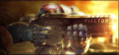
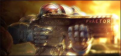
Syphon's first is good, 7-8/10, but the second looks kinda random IMO. I can't really tell what the render is supposed to be.
I'm not a big fan of BeDazed's sig, too bright and I don't like the "Sergeant" on the side. 4-5/10
None.
Quote from Doktor Shotgun
Syphon's first is good, 7-8/10, but the second looks kinda random IMO. I can't really tell what the render is supposed to be.
I'm not a big fan of BeDazed's sig, too bright and I don't like the "Sergeant" on the side. 4-5/10
It a bouncer with it's helmet blown off.
http://videogames.techfresh.net/wp-content/uploads/2007/01/bioshock.jpg
None.
hmmm k, im not feeliogn that brown part in syphons first sig...was that aprt fo the stock? or where u trying to make somethign blend? if u where try using the stamp tool/clone stamp tool next time

second one is a bit over contrasted (the render part)
bedazed, not bad but im not feeling the sergent thing or the color, but the Bg is nice =)
None.
Quote from Doktor Shotgun
Syphon's first is good, 7-8/10, but the second looks kinda random IMO. I can't really tell what the render is supposed to be.
I'm not a big fan of BeDazed's sig, too bright and I don't like the "Sergeant" on the side. 4-5/10
It a bouncer with it's helmet blown off.
http://videogames.techfresh.net/wp-content/uploads/2007/01/bioshock.jpgThe problem is you can't really tell from the sig. And it's not the sort of thing where it looks sweet even though you can't tell WTF it is.
This is just my opinion, so it means shit, but w.e.
I also agree with Zombie, the brown part kinda ruins the second one but I still like it.
None.
As to bad comments for my last sig, how about this one?
None.