Staredit Network > Forums > Staredit Network > Topic: Skin changes
Skin changes
Aug 4 2010, 3:17 pm
By: rockz  

Aug 4 2010, 3:17 pm rockz Post #1

ᴄʜᴇᴇsᴇ ɪᴛ!

This is either a new skin idea thread, or updates to turtle. If you have any nice pictures for banners, post them!

Essentially what I plan on doing is making at least one new skin in firebug, with changes that I like. If you like the change, say how much. If you don't like the change, explain why. Please make sure you quote properly too, so I can know what you're talking about. If you quote a picture, put it in a collapse box. I don't have code access or anything, so there's no guarantee that this will become a new skin.

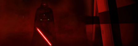
Pic 1: Background Image on the forums and index
Collapsable Box

backgrounds

Pic 2: Curves and Gradients:
Collapsable Box


Post has been edited 3 time(s), last time on Aug 4 2010, 5:01 pm by rockz.


"Parliamentary inquiry, Mr. Chairman - do we have to call the Gentleman a gentleman if he's not one?"

Aug 4 2010, 3:43 pm Excalibur Post #2

The sword and the faith

I like everything but the transparency.


SEN Global Moderator and Resident Zealot
-------------------------
The sword and the faith.

:ex:
Sector 12
My stream, live PC building and tech discussion.

Aug 4 2010, 3:47 pm Aristocrat Post #3


Lol 2 minutes in PS.

EDIT> I thought the background tiling was pretty unnecessary, and it's too bright. Make it about 20% opacity.


None.

Aug 4 2010, 3:51 pm rockz Post #4

ᴄʜᴇᴇsᴇ ɪᴛ!

Quote from Aristocrat


Lol 2 minutes in PS.

EDIT> I thought the background tiling was pretty unnecessary, and it's too bright. Make it about 20% opacity.
Banners are easy, I'll do those later. Now I just want to update the actual site.

I don't think 20% opacity looks like anything.


Post has been edited 1 time(s), last time on Aug 4 2010, 4:00 pm by rockz.


"Parliamentary inquiry, Mr. Chairman - do we have to call the Gentleman a gentleman if he's not one?"

Aug 4 2010, 9:12 pm MadZombie Post #5


-Tiled no Alpha
-Leave it Static (non static would remind me too much of geocities or some other unprofessional site. Also Myspace)
-Out of the three I liked the one you used best. The red one /feels/ too bright with too many things going on in it as I personally prefer darker layouts. The other one is just too low quality in my opinion. The only use able part from it is the starts without the planet. Planet looks like a .gif made out of .gifs.
-The css gradient or whatever is too bright. It should be at the point where it's a little but more then unnoticeable.
-My vote is 'No' for the curves.

If that gradient was at say 100% opacity I think you should head over to 30% and if it were 50% then 15-20%

Post has been edited 1 time(s), last time on Aug 4 2010, 9:20 pm by MadZombie.


None.

Aug 4 2010, 9:47 pm Aristocrat Post #6


Quote from rockz
Quote from Aristocrat


Lol 2 minutes in PS.

EDIT> I thought the background tiling was pretty unnecessary, and it's too bright. Make it about 20% opacity.
Banners are easy, I'll do those later. Now I just want to update the actual site.

I don't think 20% opacity looks like anything.

Oh, I meant 20% of the original, not what you had. I assumed it was at 50% or something because the nebula was not very bright. So cut the opacity to a little less than half of what you had I guess, sorry for the confusion xD.


None.

Aug 4 2010, 10:32 pm rockz Post #7

ᴄʜᴇᴇsᴇ ɪᴛ!

20% of the original is 20%.
20% of 50% is 10%.
What?

Gradient is at 255-0 opacity, no image used. I'm trying to get a css chamfer, but it looks like that requires editing the html too much.

both are the same gradient, one without background color.

Post has been edited 1 time(s), last time on Aug 4 2010, 10:49 pm by rockz.


"Parliamentary inquiry, Mr. Chairman - do we have to call the Gentleman a gentleman if he's not one?"

Aug 4 2010, 10:37 pm Aristocrat Post #8


Quote from rockz
20% of the original is 20%.
20% of 50% is 10%.
What?

Gradient is at 255-0 opacity, no image used. I'm trying to get a css chamfer, but it looks like that requires editing the html too much.

20% of 100% would be 40% of 50%, basically I just wanted the nebula to be toned down by a bit more than half.

I don't personally like the gradients: makes the site look too roundish and bubble-like rather than StarCraft-y, but I guess we can still work out a better solution than the current green rectangle.


None.

Aug 5 2010, 2:53 am rockz Post #9

ᴄʜᴇᴇsᴇ ɪᴛ!

you *have* seen the forum index right?


"Parliamentary inquiry, Mr. Chairman - do we have to call the Gentleman a gentleman if he's not one?"

Aug 5 2010, 3:41 am DavidJCobb Post #10


A veeeery subtle gradient, like on the forum index, could easily be implemented using a cross-browser background image. Now granted, I don't know how much I can change the code for topics, but I could try to get the Forum Index's stylish clipped corners onto each post or something. It depends on what I can code and what I can design.

Also, try a tiled fixed background, with 30% and then 40% alpha instead of 20%. Also try maybe a higher opacity with greyscale. 'S my two SENts. :awesome:


None.

Aug 5 2010, 5:58 am rockz Post #11

ᴄʜᴇᴇsᴇ ɪᴛ!

The method used to create the chamfer is poor in all browsers, but especially poor on SEN. If a background image is used, it would be better to use a background image corner with an alpha channel covering up the background rather than covering up the box. There's a way to do it in css, but you need a separate span/column to do so before and after the box the size of the border width.


"Parliamentary inquiry, Mr. Chairman - do we have to call the Gentleman a gentleman if he's not one?"

Aug 6 2010, 2:20 pm NudeRaider Post #12

We can't explain the universe, just describe it; and we don't know whether our theories are true, we just know they're not wrong. >Harald Lesch

I love the curved/gradient design. Have you tried angled instead of curved? Because that should be more in style with Turtle.
Fading out looks neat - my favorite option, otherwise take tiled.
The transparency is fine
The background needs to be static. Can't stress enough how important that is.
Seeing it in action I like the background pretty much. If you're not tiling you could add a star or a subtle planet here and there but it's not really important.

Glad someone is taking the job of making Turtle better. :thumbup:


Aug 6 2010, 2:45 pm rockz Post #13

ᴄʜᴇᴇsᴇ ɪᴛ!

Quote from NudeRaider
I love the curved/gradient design. Have you tried angled instead of curved? Because that should be more in style with Turtle.
If I do a small curve, it will sort of look angled, and match the forum index more. The method to do angled relies on careful design of cells, or using a mask. The mask is easier, uses a picture, and goes over top of the background. The cell method is detailed here
Quote from NudeRaider
Fading out looks neat - my favorite option, otherwise take tiled.
Tiled will be much smaller.
Quote from NudeRaider
The background needs to be static. Can't stress enough how important that is.
Others have stressed how that will make it look like a geocities site. I tend to agree with you, especially if I use a fading image.
Quote from NudeRaider
Glad someone is taking the job of making Turtle better. :thumbup:
I think I'll recolor it to red or something and call it painted turtle (red), and use the background on the right.


"Parliamentary inquiry, Mr. Chairman - do we have to call the Gentleman a gentleman if he's not one?"

Aug 6 2010, 8:31 pm UnholyUrine Post #14


I likes... but I'm worried that slower computers will have problems... (but.. they should get a new comp instead lol)

Red turtle will be nice... tho must we copy nintendo? lol
How about Red Storm or smth...


None.

Aug 6 2010, 9:43 pm DavidJCobb Post #15


Quote from rockz
The method used to create the chamfer is poor in all browsers, but especially poor on SEN. If a background image is used, it would be better to use a background image corner with an alpha channel covering up the background rather than covering up the box. There's a way to do it in css, but you need a separate span/column to do so before and after the box the size of the border width.
Wait, not sure what you meant here... Using the terminology from your later post, are you saying that an extra cell (!) is better than a mask?


None.

Aug 7 2010, 3:50 am rockz Post #16

ᴄʜᴇᴇsᴇ ɪᴛ!

Yes, an extra cell is better than a mask. A mask covers up. An extra cell doesn't. See what I mean?

I don't like either method, and perhaps a mask with background would be better, or just don't use a mask and instead use a picture with alpha. Who knows? What I do know is that if we make changes to the css, we also have to make changes to the images. Wouldn't it be nice to not have to do that, and do it all in css? You can see there's still a few leftover off color images in the forum index.

Red turtle is because it's based on Corbo's turtle. Has nothing to do with monstrous turtles.


"Parliamentary inquiry, Mr. Chairman - do we have to call the Gentleman a gentleman if he's not one?"

Options
  Back to forum
Please log in to reply to this topic or to report it.
Members in this topic: None.
[2024-6-12. : 6:23 am]
Ultraviolet -- got some light recalls behind too
[2024-6-12. : 12:07 am]
O)FaRTy1billion[MM] -- 🦗
[2024-6-11. : 9:53 pm]
Wing Zero -- I wonder how he knew I was in the market for a good cricket bat
[2024-6-11. : 2:27 pm]
lil-Inferno -- ya
[2024-6-11. : 10:49 am]
Oh_Man -- or scarab maybeh
[2024-6-11. : 10:49 am]
Oh_Man -- shielt battery + photon cannon blast?
[2024-6-11. : 10:49 am]
Oh_Man -- check out the animation at 7:56
[2024-6-11. : 9:06 am]
Oh_Man -- https://youtu.be/3mpjxspSUtQ I defeated the hell boss yall, bow to my power
[2024-6-10. : 5:04 pm]
lil-Inferno -- poop
[2024-6-06. : 5:20 pm]
Ultraviolet -- I was kinda thinking something along these lines
Please log in to shout.


Members Online: Laver102, moataz