Heh, this topic has lost a lot inactivity for some time. Ah whatever.
Anyways, after practicing and practicing for days on end on drawing, I've finally passed a cornerstone on my drawing skills. Instead of that cartoony,blocky,uneven stuff, I now started adapting to the styles of manga art. The only thing is ,which sets apart cartoon from manga is that manga includes alot more steps and well can be a pain to draw altogether. But, the finish product looks highly more professional and detailed. So, I chose to go that road considering it's quite a popular method people have been using for some time.
So after reading manga art drawing reference books and practicing drawing different parts of the body, I bring them all together into one piece(no pun intended). My test subject/mascot. Cilly Cillianno. Here's the unfinished draft I have so far and when I mean unfinished, I mean not complete.


Notice theres no facial parts,feet,completed hair or completed hands. Those, I'm still working on. So far, I'm proud of my progress. From grade 1 stubby circle sketches to grade 9 somewhat detailed bodies.
None.
Practice a few dozen more days on end. I guess I'll post the last thing I drew. 6 months ago. The swan song records logo.
It's not finished in this one... But I gave it to a friend of mine and she keeps it at school so I can't get a proper scan. I made some parts darker and fixed hair perspective.
None.
A sketch using, of course, iScribble.

None.
Do you use a graphic tablet to draw that on the computer because personally, I sometimes find it ridiculous (in a funny way) how people can draw stuff like that with just a mouse. Because the mouse is quite hard to keep control with.
None.
Yes, I'm using a Wacom Tablet. I can do the same thing with a mouse, but it would just take a lot long than usual.
None.

ALL PRAISE YOUR SUPREME LORD CORBO


Free hand sketching for the win!
http://youtube.com/watch?v=Vu9orvtStdY
fuck you all
Yes, I'm using a Wacom Tablet. I can do the same thing with a mouse, but it would just take a lot long than usual.
That was with a tablet?
...
I thought you were really good with a mouse, but now my opinion changes.

None.
All of my iScribble drawings are with a tablet.
All drawings previous to that were done with a mouse.
None.
Heres 2 pages of some rough draft gull sketches I drew in animation class apart of my animation assignment.


And heres the completed rough draft of the 8-year old girl I drew, Cillianno.
Note* Disfiguration of paper is from the scanner. Also fixed some mistakes from previous sketch.
 Post has been edited 1 time(s), last time on Apr 10 2008, 9:15 pm by JordanN.
None.
ALL PRAISE YOUR SUPREME LORD CORBO
In the first one the fish is actually a nice looking shape.
But just nice.
fuck you all

STF mod creator, Modcrafters.com admin, CampaignCreations.org staff
Dear HolySin:
Great work, especially in post #103. I like the stylized exaggeration of her head proportions.
Dear Jordan:
Hey, keep at it. That's what it takes to improve. The seagulls are looking pretty good. On the girl, obviously anime-styling, but the eyes are overly close together and the head is very long, which compounded together gives a very odd look.
Dear Wizard:
Very nice, particularly the first anime girl, Vita. Great linework, nice composition (maybe a some kind of emotion, though?), professional quality. The belt buckle is wonky, though. Second piece is obviously rough, with mutant chubby fingers. =o)
Dear RoryFenrir:
I really dig the Star Destroyer, though it looks like you got a bit carried away with the deep shadow on the right side where the shield deflectors stand. The prisma color nuke is interestingly organic in its rounded layers of color. I like it.
Dear Cob:
Nurture that creativity. Also, the pen can be a great tool. My friend Phillip is
testament to that.
Dear everyone:
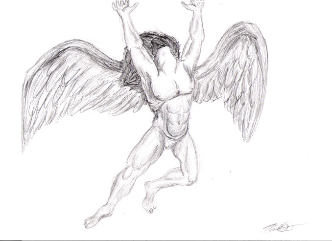
I guess I'll add something to the pot.
 Post has been edited 5 time(s), last time on Apr 11 2008, 10:52 am by Hercanic.
That is fucking awesome dude. I can't say much about the technical drawing of it, but I love the creativity. It looks like a sketch for something to be imported into a movie.
None.
The technical drawing is excellent for the most part, though it lacks shading. I want to draw it now. Where's my pencil.
None.
ALL PRAISE YOUR SUPREME LORD CORBO
The technical drawing isn't good at all. Lacks shadows, pencil quality, volumetry between many things that I will stop to mention because if I don't I'll start with one of my bastard analysis.
And unless that thing is flying while producing flames or something it MUST have a projected land shadow.
Second look, it does have a suggested pencil quality but my guess is that he didn't use different pencil graduations, I stand with that unless he says otherwise.
fuck you all
The technical drawing isn't good at all. Lacks shadows, pencil quality, volumetry between many things that I will stop to mention because if I don't I'll start with one of my bastard analysis.
And unless that thing is flying while producing flames or something it MUST have a projected land shadow.
Second look, it does have a suggested pencil quality but my guess is that he didn't use different pencil graduations, I stand with that unless he says otherwise.
"Although it lacks shading"
As a sketch, it is technically sound.
None.
ALL PRAISE YOUR SUPREME LORD CORBO
So... you draw a sketch and the basic rules & concepts of design & drawing don't apply just because you drew an sketch?
fuck you all