So i had somebody make the artwork for the ep i'm gonna release, i had them listen to two songs that were the style of the band the most and told him let the music inspire to to create it cause i had no clue what i wanted.

thats how it came out, now i like it but im not 100% sure.
i had him listen to 'tonight wont make a difference' and 'insane improvised instrumental'
http://www.myspace.com/thehighercolorgive me your opinions, and if any of you want to give it a try, see if you could best him or something i'd appreciate it, to see what others take from it.
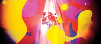
So i had somebody make the artwork for the ep i'm gonna release, i had them listen to two songs that were the style of the band the most and told him let the music inspire to to create it cause i had no clue what i wanted.
imagethats how it came out, now i like it but im not 100% sure.
i had him listen to 'tonight wont make a difference' and 'insane improvised instrumental'
http://www.myspace.com/thehighercolorgive me your opinions, and if any of you want to give it a try, see if you could best him or something i'd appreciate it, to see what others take from it.
I think it's great, if you were a French Electro-act. But I don't think it fit's your alt-indie. But I do like the cover.
Post has been edited 1 time(s), last time on Sep 2 2009, 10:27 pm by FaRTy1billion. Reason: "Long quote is long" ;o
None.
I just deleted a bunch of posts full of disrespectful quips. Keep the feedback focused on the
image.
None.
The album cover says to me: 'Dance anthems'
If that isn't what your band is about then I'd suggest modifying it.
None.

ALL PRAISE YOUR SUPREME LORD CORBO


There's like no volume on it. And it's optically unpleasant to me, there's no depth appreciation and...is that a sun?
I don't know what makes me wanna kill myself more, the fake scratches that completely ruin the intention of depth the lightning is giving you or the fact that the element that's supposed to be powerful and representative (hint: the symbol) isn't even centered or at 1/3 of the composition.
Tell that to your friend. If he's someone smart he'll listen to what I say and realise the mistakes he made and fix them unlike you that you just completely ignore any good advices.
fuck you all
There's like no volume on it. And it's optically unpleasant to me, there's no depth appreciation and...is that a sun?
I don't know what makes me wanna kill myself more, the fake scratches that completely ruin the intention of depth the lightning is giving you or the fact that the element that's supposed to be powerful and representative (hint: the symbol) isn't even centered or at 1/3 of the composition.
Tell that to your friend. If he's someone smart he'll listen to what I say and realise the mistakes he made and fix them unlike you that you just completely ignore any good advices.
he has actually edited every song that is on that site, but hes only allowed 4 uploads, he has taken the advice and his songs are much better.
None.
Get rid of the bars on top of the name and make the bright light larger.
None.