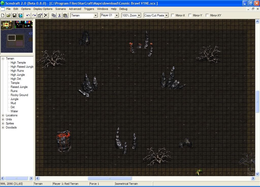
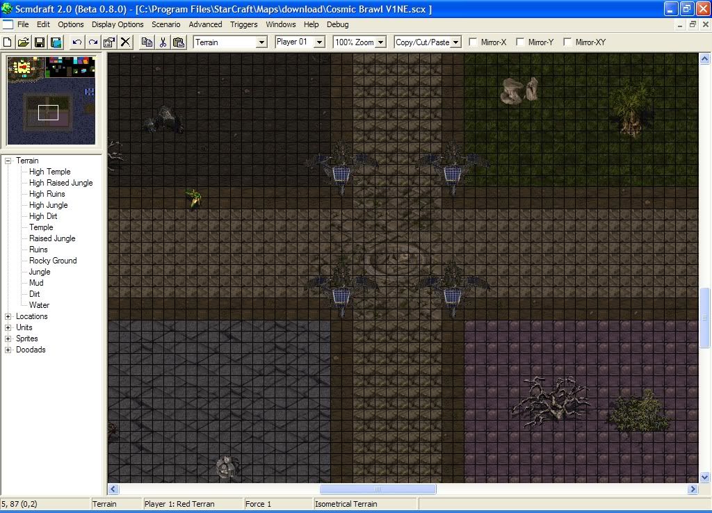
After editting out several bugs and whatnot in my recent map. I went back to another thing someone had posted earlier about the terrain being flat and quite plain. I took the advice into thought before working on it today. I know it problely looks pretty bad and chopy, but I don't want the map terrain to be hindering to movesets for Characters or for people themselves when they battle. I split the Arena up into 4 individual points of interest. As a matter of fact, something unintended happened and one of the zones acually restricts a characters move from being placed in the zone, which has stragetic advantages. But what I want to know, Is there anyways I can make this a bit better without damaging Arena Gameplay?
Molten Rock Zone
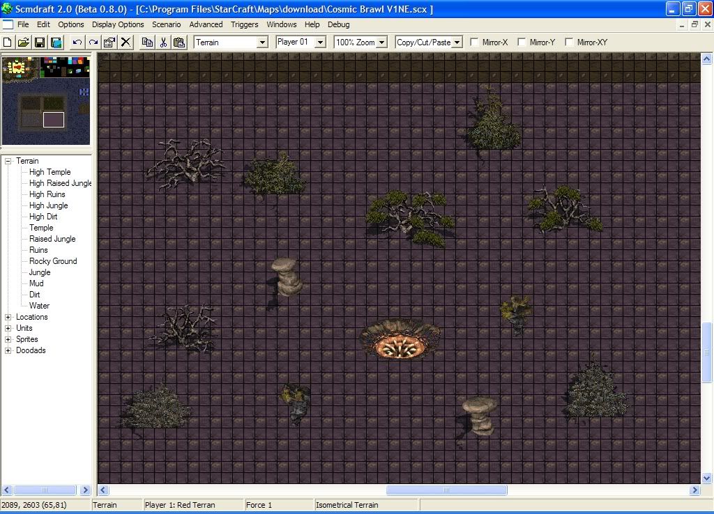
Desolate Plains Zone
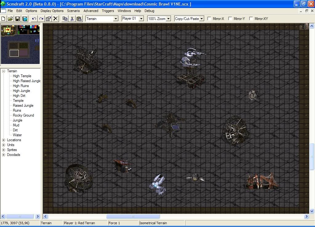
Mechnical Junkyard Zone
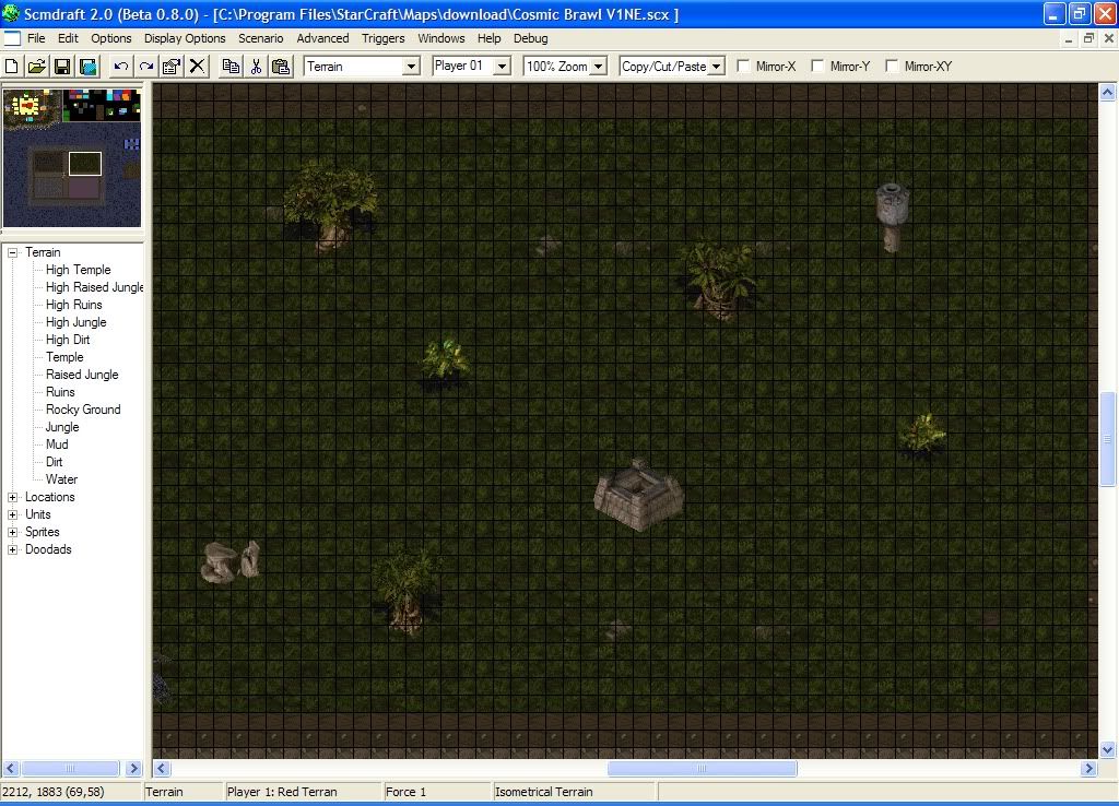
Anicent Forest Zone
Midsection Between Worlds
None.
The placement of the sprites/doodads/whatever looks messy. It's not helped by the fact that most of the sprites you're using don't mix well with the terrain, and have sharp, contrasting edges.
As far as making it more aesthetically appealing goes, just try and add diversity to your arenas. Look at the "Brush Project" and "Visual Effects List" topics (they're stickies in this forum) and see if you can pull something from them and add it onto your map.
Also, I understand that you're trying to go for a different theme for each area, but honestly, nobody will really care what the areas are called. If your map has good gameplay, then the players won't notice a small detail like the theme of a specific spot. Keeping this in mind, I would recommend you go ahead and mix up your terrain; even random patches of isometric terrain placed all over the map looks better than just a flat rectangle.
None.
I don't really see how each area has a strategic advantage. It's not like SC2 where zerg units move faster on creep or anything. I recommend using isom terrain inside the area and then cutting the borders straight with square water. You can blend with isom and looks better. Having a flat square area with some terrain type looks okay, but when you have multiple terrains within an area, it just looks tacky. Make it isom and have it blend. Trust me; it'll look much better.
Quote from name:Dem0nS1ayer
I don't really see how each area has a strategic advantage. It's not like SC2 where zerg units move faster on creep or anything. I recommend using isom terrain inside the area and then cutting the borders straight with square water. You can blend with isom and looks better. Having a flat square area with some terrain type looks okay, but when you have multiple terrains within an area, it just looks tacky. Make it isom and have it blend. Trust me; it'll look much better.
This, definitely. Right now it looks like a large flat open space, and those doodads look extremely out of place. If you want it to be all on the same level, it would still help to have some cliffs around the edges or in the center or something, just to break it up a bit.
 Currently Working On: Myself
I changed the terrain to the Isometric Blend idea you where talking about. And added a center cliff for the first spawn area. It does look better, but oddly enough when I play ingame I feel like my screens closer to the ground...
Edit: Woops, Thanks lol.
Isometric(Without the Grid)
 Post has been edited 1 time(s), last time on Jul 30 2011, 4:37 pm by ScaleMatrix.
None.
Don't take screenshots with the grid on.
You want your doodads to be illegally placed like that?

Ewwwww.
And of course it's closer when you actually play. Scmdrat is zoomed further out than the actual Starcraft window.
Illegally placed? Im guessing that has to do with the center doodad
None.

An artist's depiction of an Extended Unit Death


Quote from name:Dem0nS1ayer
And of course it's closer when you actually play. Scmdraft is zoomed further out than the actual StarCraft window.
This is actually based on screen resolution. Since almost nobody runs near 640x400 anymore, having SCMDraft maximized is going to show more than what SC will.
On that note, just remember that SC's screen size is 20x12 tiles. The two bottom tiles are almost completely covered by the UI, though, so to fit something completely on the screen, it needs to be within a 20x10 tile area.
Illegally placed? I'm guessing that has to do with the center doodad
Demonslayer is referring to the "ugly" terrain. Do you see how it squarely cuts off the grass and ruins? For a smooth blend, you want to have dirt and high dirt around your ramps, and you want ruins around that ruin doodad.
Just sprites... really?
I see what your doing though; having no blockage for balance.
Post has been edited 1 time(s), last time on Oct 9 2011, 12:58 am by Tempz.
None.


 RIVE -- Lots of fun little nods to different works of others in the cheats too.
 Oh_Man -- so i was today years old wen i learned rebel yell starcraft mission is named after a billy idol song. makes me wonder wat other missions are named after songs