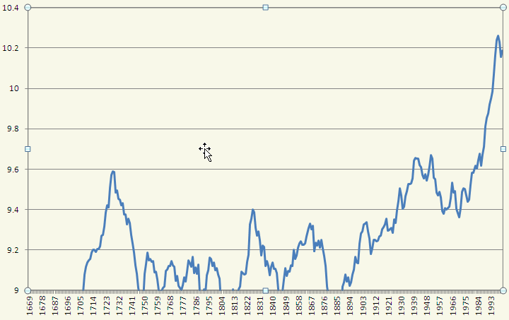
There is NO REASON for the temperature to be 'zoomed out' other than to misrepresent the data.
Yeah! And they definitely shouldn't have used green for the arrow, I mean so many people associate "green" with "good" or "go" that they're definitely playing psychological tricks on you to get you to believe everything is "good."!!!!! These fiends!! They're evil manipulators!!
Joking, obviously, but I'm merely saying it isn't zoomed out to the point where its in any way misrepresentative. I've seen cases where graphs are horribly distorted like you describe, and I just don't think this is one of them. Maybe it is, but unless you have something revolutionary to say about this point I'm done with it.
But use a proper graph like the ones I gave, not one drawn up by a climate change skeptic with the intent to deceive.
What's the old saying? If you go looking for worms you'll find worms, or something like that. Point being, you started this conversation based on the premise I was a "climate change denier" using "misrepresented" data, and with the goal to disprove me, rather than analyze what I put forth for its own merits.
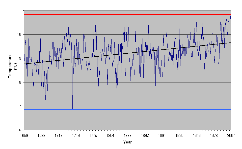
The further back in time you go, the lower that slope would get. If you're trying to pinpoint a correlation between CO2 emissions and temperature variation, you don't tack on hundreds of years of data where there were ZERO CO2 emissions!
The slope could just as easily grow much larger, with a few hundred more years of data. The prior hundreds of years of data is absolutely necessary in determining the effect of CO2 on the global climate. I would have thought you'd know this, but the statistical correlation is derived as follows:
1). We have a set of data pertaining to a situation (climate change in this case)
2). From this data, we can establish normal parameters like variance, covariance, mean, etc, about this data.
3). We have a new set of data pertaining to the situation which falls outside the established parameters
=> Since everything except CO2 levels has remained constant, the CO2 is responsible for the variation from established trends.
The strength of this inference is based upon the strength of the data, 1) and 3). The stronger and more normalized your initial data set, 1), and the more variant your 3) data set is, the stronger the implication that your hypothesis was correct (unless you're really wrong and theres some other force that is responsible, or your model is incorrect or something like that). Perhaps I have assumed you had some basic knowledge of statistical properties, but if not, I encourage you to read about
the Law of Large Numbers, which essentially forms the basic principle on which these kinds of inferences are made. (Which in essence I demonstrate below).
The average hasn't dropped below 9 in AGES. You don't need another 40 or 60 years to finally make up your mind
The 11-year simple moving average hasn't dropped below 9 degrees celcius in approximately 1.2 centuries, correct, but I am baffled as to why you're choosing an 11-year-moving-average as the basis for all your statistical claims. I'm also not sure why you are assuming 1.2 centuries qualifies as "AGES", since we're talking about temperature cycles, and not how long its been since you watched your favorite movie. Back to the 11 year moving average, Let's consider by analogy: Suppose I had a bucket, and I told you that if you reached into it, one of two things would happen: Either you would pull out a 10-lb ball of pure gold (I'm sorry, 44.48 Newtons for you metric users

) or your arm would get chopped off. Now I have my friend joe reach in first, and he pulls out a 10-lb ball of gold. Are you going to want to stick your arm in there? No! (Unless you're not a risk-adverse person at all maybe). There hasn't been sufficient sampling done yet to establish any sort of reliable trend or probability for either of the two options. Maybe joe got lucky and got the .0001% chance who would pull out gold. Maybe you say to me "No way! what if the chance is .0001% of pulling gold out?" So I have my friend Ted come over, and he pulls out a ball of gold too. Now, this doesn't change the probability of pulling gold out, but it
does change the probability that the unknown gold-probability is extremely low. The more times we can reach in the bucket and record the outcomes, the more sure we can be about the probabilities of those outcomes.
My point, is that even your 11-year-moving average has a period (by which I mean period of periodic functions, i.e. period of sin(x) = 2*pi) of approximately 4 decades (I'm estimating purely by eye, but I think you get my drift). So in that 350 year time frame, that means we have roughly 9 data points. One of those points is what we are trying to come to a conclusion about, so we are comparing our data to 8 other points. This is not sufficient, in a rigorous sense, to establish a trend. However, its all we have, so we may as well use it all in making our predictions. This is why you add those extra 2 centuries of data on to the analysis, because without them, the evidence for "CO2 is causing global warming" is half gone. In essence, Oh_Man, this:
If you're trying to pinpoint a correlation between CO2 emissions and temperature variation, you don't tack on hundreds of years of data where there were ZERO CO2 emissions!
Is dead wrong from a statistical standpoint.
That concludes my defense of the graph, but returning to the year 1730, I wonder if the
volcanic activity had not happened, would the trend from 1690-1730 have continued? If we had another 400 years of data I think that would be a very significant piece of the puzzle to analyzing our own climate change problem.
Also, what I wrote above is one reason the people from Lanthanide's link are using 1.6 billion data sets.
None.


 Azrael


 Looking at one specific location to disprove global warming is a pointless venture. Each specific location has its own weather anomalies and yearly highs and lows that could obscure the temperature increase. For example, the