Staredit Network > Forums > Media, Art, and Literature > Topic: Aristocrat's Signature Shop
Aristocrat's Signature Shop
Jun 28 2010, 8:24 pm
By: Aristocrat
Pages: 1 2 3 >
 

Jun 28 2010, 8:24 pm Aristocrat Post #1


So I know half of SEN probably hates me for whatever reason, but I would like to offer my limited services regardless.

It's summer, and aside from work and college applications there is a large chunk of time that I need to spend on something. I could only study or read so much in a day and I need something to distract myself so I don't wear myself out; I decided that practice with photoshop would be nice to do, and seeing the recent devilesk signature fad I decided that something must be done.

Aristocrat's Free Signature Shop:
Post a render/image that you would like to be the centerpiece of your signature, or give a large picture from which to crop your signature from. Specify text, color, border style, specific brushes to use, and other image modifications if you want.

Results will be similar to the below:
(113 layers)


(20 layers)


(16 layers)


(7 layers)


Commissioned Signatures:

Lakky: 2 images

LoTu)S: 4 images

LoTu)S: 2 images

CecilSunkure: 5 images

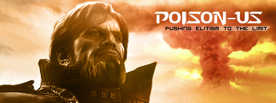
poison_us: 1 image

LoTu)S: 1 image

ETEFT(U)/B-ETEFT: 1 image

CAFG/ClansAreForGays: 1 image

Placeholder


Even if you don't want a new signature, post anyways so I have an objective to aim for, and not just mess around with pen tool and ink for eternity >_>. Thanks!

(How do you increase the size of an encasebox tag?)

Post has been edited 6 time(s), last time on Jul 2 2010, 6:54 pm by Aristocrat.


None.

Jun 28 2010, 10:13 pm Lakai Post #2


K im going to be very unspecific with this, have some fun with it :)

one of these renders i would like used:

Fun cartoony style:
http://www.contagiousgraphics.com/Stickers/stickerSamples/HRStrongBadClearStix.jpghttp://www.contagiousgraphics.com/Stickers/stickerSamples/HRStrongBadClearStix.jpg
http://fc01.deviantart.net/fs14/f/2007/021/1/8/Strong_Bad_Bear_Shark_by_StudioBueno.jpghttp://fc01.deviantart.net/fs14/f/2007/021/1/8/Strong_Bad_Bear_Shark_by_StudioBueno.jpg
(the bear holding the shark)

More serious style:
http://userserve-ak.last.fm/serve/_/34503657/Wiz+Khalifa.png
http://www.nuintel.net/wp-content/gallery/dillo-day-2010-the-likely-lineup/10-wiz-khalifa.jpg

Other then that its up to you, You know more about photoshop then me so be creative :)

Text on sig: Lakky

tyvm


None.

Jun 29 2010, 1:54 am LoTu)S Post #3


Need a variety of sigs, make me one from this

http://fc02.deviantart.net/fs46/f/2009/197/0/b/Starcraft_Reaver_Plushie_by_HezaChan.jpg

Try to isolate the main and add some effects in the background. Text being LoTuS would be nice. You determine most of the features.

If it doesnt look too good, this pic works too:

http://fc09.deviantart.net/images3/i/2004/148/5/e/Wallpaper_Starcraft_Ghost.jpg


None.

Jun 29 2010, 2:58 pm Aristocrat Post #4


The hardest part of the sig is getting rid of the white background around the guy. Other than that, I had no idea what to do so I just randommade a BG.

FLUFFY REAVER WILL ARRIVE IN SHORT ORDER.

EDIT>


:awesome:

Collapsable Box


Post has been edited 1 time(s), last time on Jun 29 2010, 4:00 pm by Aristocrat.


None.

Jun 29 2010, 3:04 pm Tharuk Zhal Omaenha Post #5


I know this is against the TOS and all that junk BUT:

Why does everyone like anime so much?


None.

Jun 29 2010, 4:14 pm LoTu)S Post #6


luuuuuurve the reav sigs, i'll add it to the randomizer as soon as i get on a comp.
Quote from name:Gantrithor
I know this is against the TOS and all that junk BUT:

Why does everyone like anime so much?

Why do ppl like Twilight? People just do.


None.

Jun 29 2010, 4:44 pm Tharuk Zhal Omaenha Post #7


Quote from LoTu)S
luuuuuurve the reav sigs, i'll add it to the randomizer as soon as i get on a comp.
Quote from name:Gantrithor
I know this is against the TOS and all that junk BUT:

Why does everyone like anime so much?

Why do ppl like Twilight? People just do.

You made the perfect analogy, I must admit.


None.

Jun 29 2010, 7:53 pm Lakai Post #8


Dude thats fuckin awesome thank you very much


None.

Jun 29 2010, 7:58 pm Aristocrat Post #9


Here's a slightly more serious attempt at making LoTu)S's sig:


I didn't like some aspects of it, probably because I only used one part of the picture. I wonder if I can throw some more stuff in there.

EDIT> OH F- forgot to change some layers back to white. QQ


Post has been edited 1 time(s), last time on Jun 29 2010, 8:09 pm by Aristocrat.


None.

Jun 29 2010, 8:20 pm CecilSunkure Post #10


Very cool Aristocrat. LAKKY looks like LARRY, but other than that these look awesome.

I have a request as well. I would enjoy making my own signature, but there is no way I'll ever have time, so I'd appreciate if you could make this:

Raw images: http://www.videogamenews.org/wp-content/uploads/golveza.jpg
http://media.photobucket.com/image/ff%204%20cecil/spdk1/FIV/Ff4_logo.png

[encasebox][/encasebox]

Hex color wheel: http://www.visibone.com/colorlab/

I don't want any of the FF logo text from the image where Cecil has no overlapping text. However, with the image with overlapping text, I'd prefer to have that image placed on the leftmost portion of the signature with the text. I want you to take into account The Rule of Thirds while creating this signature.

I'd like the image to make use of the blue color of the Cecil character, with white as the standard backround color.

I posted up the color wheel so that you could see which colors compliment which colors. The compliment to the Cecil characters would be something along the lines of: This Color. You can use compliments for borders of the signature, or highlights to draw the eye to a specific portion of the signature. [Edit] Notice that the orange in one of my render images is used to compliment and break up the monotony of the blue Cecil? They didn't use yellow, probably because the yellow would just get lost in the white, even though yellow would be the true compliment to the blue Cecil. If you do use yellow make sure to not let it get lost in the white, you can do this by using a darker shade of yellow, or by just using some sort of orange instead.

Overall, I'd like a simplistic yet well designed signature, without spamming with brushes wherever the render images aren't.

As for text to place, I'd like it to say CecilSunkure somewhere, and if you could throw in the text "Aspiring Game Programmer" that would be nice as well.

Let me know if you have any more questions.

[Edit] One more thing to note: Horizon lines. You should know what a horizon line is, so I'll not explain that. With horizon lines, don't ever place a horizon line in the middle of the image. Look back to my rule of thirds post, you want your horizon lines, if any, to lay on or around one of the thirds lines.

General composition rules: Don't ever let the border to two major objects in your image touch, always make things overlapp or be spaced apart as to allow the eye to differentiate between the two objects easily. Don't place focul points on all four intersections of the rule of thirds lines. Don't have a ton of lines or objects (example: spears) all pointing straight up and down; make them point generally to a focul point of the picture (usually created with the rule of thirds), and have them intersecting and jutting at slightly different angles. Things that are farther away are more faded due to the Earth's atmosphere, and are not darker. That's all I can think of off the top of my head, and you don't necessarily need to use of all them in this signature. They are just things to know or think of.

I'll critique this piece's composition really fast:


The horizon of the bright backround to the dark is well placed. However, the dark backround touches the edge of the LOTUS word, and would look much nicer if it stopped short of the word LOTUS, or went all the way through up past the top of the image. The middle of your image is the brightest, and this creates a separation of the left and the right of your image. That's bad. You might as well have two separate images. Instead of what you did, you should have moved your bright spot behind the character's head, as to place focul points of the entire images where the Rule of Thirds lines intersect. Doing these two things would have made your image much more solid. I have to go right now.

Post has been edited 4 time(s), last time on Jun 29 2010, 9:05 pm by CecilSunkure.


None.

Jun 30 2010, 2:34 pm Aristocrat Post #11


Oh man, I may have failed this epically, sorry Cecil ><.

The renders you gave were fairly monochromatic and their 2D low-contrast vector style meant that I couldn't just smudge a background out of it (like I did to LoTuS's). I didn't see a good way to lay out both renders and still have space for effects, and pretty much adding *anything* to the sig made it look overly cluttered, so I ended up with this:


I pray that I didn't butcher it too badly.


None.

Jun 30 2010, 8:09 pm StarBlue Post #12


I already have the best sig (>^_^)>


None.

Jun 30 2010, 8:12 pm poison_us Post #13

Back* from the grave

Yo, hit me up dawg. I'd like something with Arcturus Mengsk, but other than that go crazy. Oh, and please, no diagonal line bullshit :awesome:


Jun 30 2010, 8:28 pm CecilSunkure Post #14


Well, it turned out really close to what I wanted! I'm impressed.

Great use of the yellow, doesn't it give the signature a nice and well-balanced feel to it?

I'm assuming you still have your photoshop project saved somewhere, so you can modify this a little bit, right? If so, I'm thinking that a border like you have in this sig:


Would be perfect. Instead of having the shaded border be over the entire signature, I think it would look best if it laid behind both of the Cecil images, and covered over the white backround and the yellow at the bottom left. I'm thinking this would frame the whole signature and help tie it all into one coherent and appealing piece. Could you do that :cecil: ?


None.

Jun 30 2010, 8:49 pm Aristocrat Post #15


The border originally utilized a clipping mask (as opposed to some % of alpha transparency), so I can't really get an identical effect because there's nothing in the background xD. But here it is:


(I put some fill in the Cecil layer because I thought it looked poor otherwise, but I can change that.)


None.

Jun 30 2010, 8:53 pm CecilSunkure Post #16


Yeah that style would be great! You missed a small portion on the bottom right, and I'd also like to see the border placed on the top and bottom of the sig as well. So could you please post up two more copies? One with the bottom right corner fixed, and one with a border around all four edges? Thanks :cecil: !

One more thing: Leave the white in the Cecil on the right where his shoulder is.


None.

Jun 30 2010, 9:05 pm Aristocrat Post #17


That bottom-right part is part of Cecil's armor, actually, so I wasn't sure about removing it.


I see some aliasing artifacts; tell me which version you want and I'll fix them :D.


None.

Jun 30 2010, 9:09 pm CecilSunkure Post #18


I like the bottom one the most. You can go ahead and just get rid of those Japanese characters under the FF logo, as you'd have to change their color or something to make them stand out, and in the end it would probably just be clutter or just plain not fit in with the rest of the image. Alias fix on bottom one please? :cecil:

Oh snap, one more thing: The yellow layer at the bottom right is making the grey border yellowish. Could you fix that too? Hmm, and the blue swirl coming from CecilSunkure is hitting into the border, could you erase that just as it hits the border? I changed my mind, I like that how it is.


None.

Jun 30 2010, 11:16 pm Tharuk Zhal Omaenha Post #19


Quote from Aristocrat
Here's a slightly more serious attempt at making LoTu)S's sig:


I didn't like some aspects of it, probably because I only used one part of the picture. I wonder if I can throw some more stuff in there.

EDIT> OH F- forgot to change some layers back to white. QQ


Hey aristocrat, not to barge in on your topic once again (actually, I think I will) but:

I'm curious as to how you made the HUDish decoration in the signature? Did you mad it manuaklly or is it a brush?


None.

Jun 30 2010, 11:23 pm Aristocrat Post #20


Quote from name:Gantrithor
Hey aristocrat, not to barge in on your topic once again (actually, I think I will) but:

I'm curious as to how you made the HUDish decoration in the signature? Did you mad it manuaklly or is it a brush?

It's a brush, although it's trivial to make with a bunch of lasso tools. The text can be made with lorem ipsum shrunk to 3pt font :P.

Cecil: done.


None.

Options
Pages: 1 2 3 >
  Back to forum
Please log in to reply to this topic or to report it.
Members in this topic: None.
[01:56 am]
Oh_Man -- cool bit of history, spellsword creator talking about the history of EUD ^
[09:24 pm]
Moose -- denis
[05:00 pm]
lil-Inferno -- benis
[10:41 am]
v9bettel -- Nice
[2024-4-19. : 1:39 am]
Ultraviolet -- no u elky skeleton guy, I'll use em better
[2024-4-18. : 10:50 pm]
Vrael -- Ultraviolet
Ultraviolet shouted: How about you all send me your minerals instead of washing them into the gambling void? I'm saving up for a new name color and/or glow
hey cut it out I'm getting all the minerals
[2024-4-18. : 10:11 pm]
Ultraviolet -- :P
[2024-4-18. : 10:11 pm]
Ultraviolet -- How about you all send me your minerals instead of washing them into the gambling void? I'm saving up for a new name color and/or glow
[2024-4-17. : 11:50 pm]
O)FaRTy1billion[MM] -- nice, now i have more than enough
Please log in to shout.


Members Online: jun3hong